Hi there! I notice a lot of posts with things like : How do I get more views? What game should I make? Etc. So I am making this guide that will teach you just that….
1. All in the Thumbnail
Like this guide says, Thumbnails are the first thing you see, and crucial to your game. Avoid putting random pictures, unrelated images, etc. I like to use Canva for my thumbnails. I am not perfect, but some of them are pretty cool ![]() Here are some additional tips on making a thumbnail.
Here are some additional tips on making a thumbnail.
- Use bright, contrasting colors to draw your viewer’s eyes to your game
- Put the name of your game IN the thumbnail!
- Use remove.bg to remove backgrounds of existing images (adding gims)
- Credit all sources, and use free photo websites. DONT use images that have any personal info, faces/animals. They will be removed. Don’t use images that don’t belong to you
Example thumbnail
2. Descriptions and Ideas
Although using guides like the ones below can be helpful, I don’t recommended taking all inspiration from them. Viewers are looking for a UNIQUE game. So try to make a game with a twist. For example, making a farm game EXACTLY like FarmChain is BORING! We already have that! But if you made it with a twist (a race, adding raising animals/making a town, etc) then people might be more excited!
As for descriptions, they are very important as well. First off, the name of your game should be distinctive and give a general idea of what the game will look like. Names like “zap them”, “this”, “idk”, etc. are not going far. The actual descriptions should be detailed, reference any other games you have made (if they like this one, they want to see more!) and any credits you need to share.
Map ideas to cure your boredom (reply with more ideas)
Specific map ideas to build - #45 by gimmaster12345
Some super easy map ideas even I could do! - #20 by WolfTechnology
(Look at the idea/catalog tag for more)
3. Mechanics
Obviously they are important. But what makes good mechanics and bad mechanics?
- Good mechanics optimize memory
- Good Mechanics are easy to fix bugs (use wire/channels as you please, but try to be somewhat consistent within each mechanic “chain”.
- Good Mechanics are sequential. This means that each mechanic will be in a certain order. For example, if you want a player to receive dialogue only ONCE when they enter a zone, you will activate the zone AFTER something happens and deactivate BEFORE moving on to the next thing (player leaves zone —> Deactivate.
- Good mechanics blend in. Some mechanics are visible in game. Pay attention to which are visible, and change them or make them invisible as the situation would have you do. For example, teleporters are not always attractive in game, so making them invisible may be a good choice for some circumstances. If you want vending machines to be natural, make them invisible and put a prop (ex: table) in front of it
- ALWAYS test play your game for bugs. I like to keep pen/paper and write down anything I need to tweak.
4. Make it Pretty!
Tips on making a game that LOOKS good!
- A LOBBY! This is SOOOO important! If people open your map and see a bunch of grass, they might leave and their expectations do this:

To make a lobby, you need to have your spawn pads there set to “pre game”. Make a lobby relating to your game, with little hints/easter eggs.
The not so quick guide on lobbies
- Layering and Collision. The amount of times someone messes this up…. (Definitely not me 0_0) Anyway… when making your map, double check that the props you want to get through have collision off, and check the layering. Use this guide:
The Power of Layers
-Props, Barriers, Text: Be creative if there is a visual effect you want that is not in the prop section. Use text/emojis, barrier combinations, etc. I would suggest avoiding using props together, as it often looks messy. The props I use to make new props are usually signs and poles.
Cool Ways to Use Props [Dificulty ⬜ or 0/10]
Cool ways to use props 2.0 (Difficulty ⬜ or 0/10)
- Terrain: Make the terrain UNIQUE! I cannot stress this enough! Here are some REALLY overused terrain themes:
- Water/Sand “fishtopia” look (sooo many)
- Grass (giving incomplete)
- JUST SNOW (add some personality! Some frozen lake/grass? )
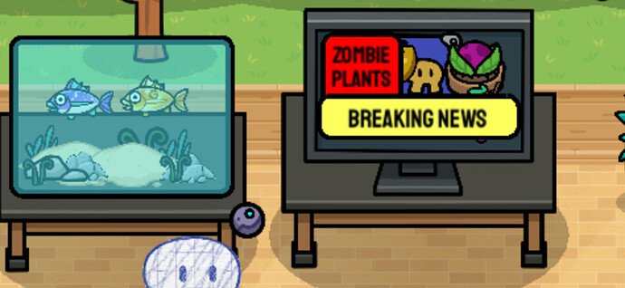
Try to use multiple kinds of terrain, experiment with layering, and use tinted no collision barriers to create custom terrain! Games with only ONE terrain, ESPECIALLY if used for both floors AND walls, are frustratingly dull. - Details: Add a bunch of little details, but avoid crowding and repetition. Look at this little aquarium and TV that makes a GREAT decal for the room!
5. More No-No’s
More no-no’s
- Making a game SUPER long and/or repetitive.
- Impossible games -_-
- Making too easy games
- Making Click-bait games (a blank game or unrelated to thumbnail, description or name) Thanks for the reminder @JoeTheChicken
- Making LIVE games. Seriously just use the WIX or play with people you know. ESPECIALLY the world editing ones used for chat…
If you want to make a longer game, you might consider using this guide to create a Save File!
And thats it! I hope this is helpful, and we can use this to respond to the notorious idea help maps…. Thanks for reading ![]()
Edit: PLEASE don’t turn this into a “make me a thumbnail” chat. Responses should only be:
- Helpful/Tips/Suggestions
- ON TOPIC, no chatting, etc
- Additional links
-Additional Ideas

