Introduction:
Yeah, we all have pre-game lobbies, most of which are cool. Sure. Great. Amazing.
I see a lot of pre-game lobbies with atrocious text. It’s plain, it has no color change, and it doesn’t blend in with the theme of the game.
Now, of course, this isn’t your problem, and you shouldn’t feel bad or anything, after all, this is only gimkit, BUT there are some ways for your text in your pre-game lobbies to look much better!
What I’d also like to talk about today are popups, which can be really cool and really well made, but just… sometimes don’t do the job well enough.
Have fun!
Method 1: Fonts
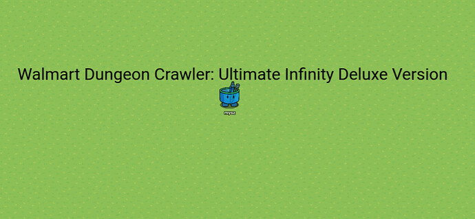
What I see a lot of times is something like this in a pre-game lobby:
Walmart Dungeon Crawler: Ultimate Deluxe Infinity Version
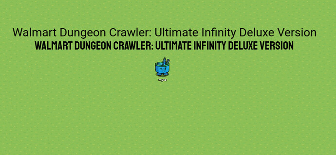
That doesn’t look too bad. HOWEVER, the text could look a lot better if someone used some of the fonts gimkit text has!
The better WDC:UDIV
Hey, that looks a lot better!
Now, I’ll put a few fonts that are pretty cold ahem I mean cool to use:

Rubik looks pretty cold ahem cool, it’s even on the default text for popups
![]()
Outfit is the standard fishtopia font
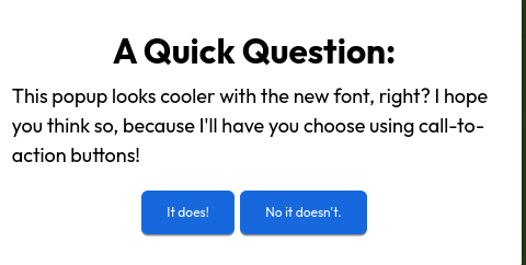
We can also use these fonts on popups to make them look better:
A popup that uses the “outfit” font
This is the power of font! Make sure to try out each kind, and see which ones you like best!
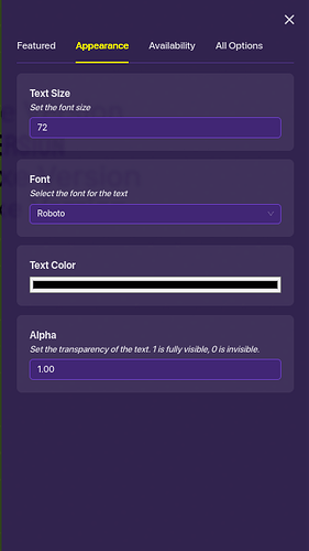
You can change the font of a text using this:
Method 2: Color and Splitting
We can’t always use black text forever. In a Humans VS Zombies game, you might want the pre-game font to be green! Luckily, we can change the color of text!
We can adjust the size, font, color, and transparency of the text. Let’s adjust the color.

Humans VS Zombies… it kind of sucks.
You can see that this looks a lot better than what… it would have been:
The two texts together… comment which one looks better!
But wait? What if we want “We Go Wildmon Edition” to be purple, and “Humans VS Zombies” to stay green?
Well, we can use a method called “Text Splitting” to do exactly this!
We know that there is no option to set a certain portion of text to a certain color- instead, we can use two text objects instead of one to make a “pseudo” multicolored text object!

The split text.
Now, I think you know what to do. Turn the right text object purple, and mash them together!
This looks really cool!
Method 3: 3D Text
We’ve gone far, but our text is still boring. Let’s ramp it up a little.
Yes, I know that 3D text doesn’t actually exist, but here’s how to “make 3D text”.
First, place down your text:

I made the font lighter, do you like it?
Now, copy the text, and make the color darker:
Get ready to do some overlapping
Now, place the darker shade of text behind the first shade of text like this:
This is me moving the text
Do it again for the second piece:

The 3D text
You’ve just made some awesome 3D text!
Method 4: Popup Decoration!
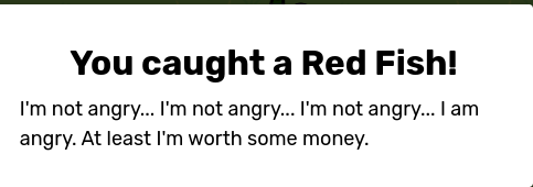
You’ve just created a fishing system, and you get this popup:
You caught a red fish!
Oh… that doesn’t look very good.
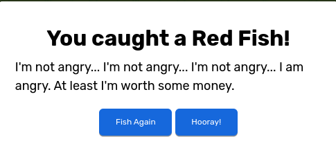
What you can first do is add some call-to-action buttons to add some blue into the mix of colors:
Would you like to fish again?
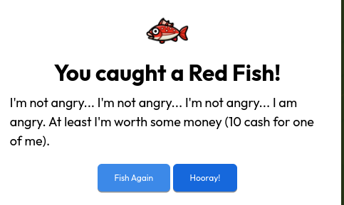
This still looks kind of bland. You know how in Fishtopia you can see the fish you just got? We can actually replicate the popup using an icon image.
Icon images can be learned here, but we’re just going to assume you know what they are.
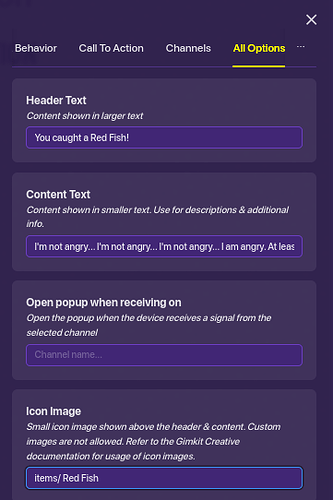
Enter “items/ Red Fish” to make your popup a little bit better.
You can only find the icon image thing in “All Options”
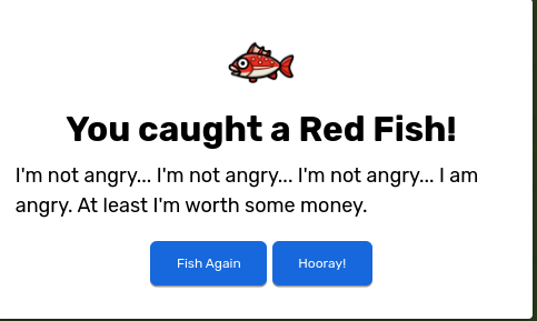
Let’s look at our popup now!
Popup with the icon image.
Let’s change the font a little. Maybe we can add something to the description too :]
You’d see something like this in Fishtopia or another real game mode. Well done!
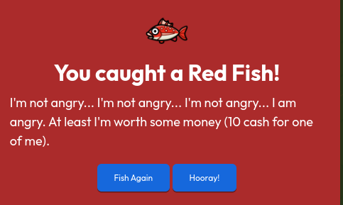
Wow! This looks good! Finally, we should add some color to our popup in the Look and Behavior section:
The final result
You did an amazing job customizing and creating a cool and unique popup! Good work!
Conclusion:
I hope this guide taught you well how to design and create your own unique text/popups, including:
- 3D Colored text.
- Popups with icon images
- Great Design
Happy gimkitting! I look forward to seeing pre-game lobbies with these features in mind!
-@mysz
