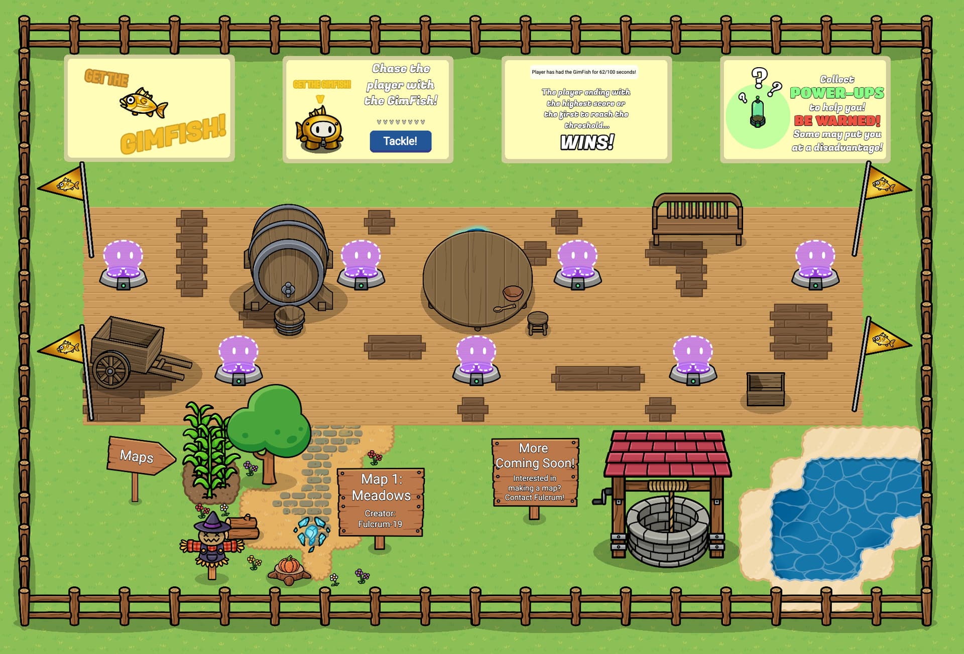
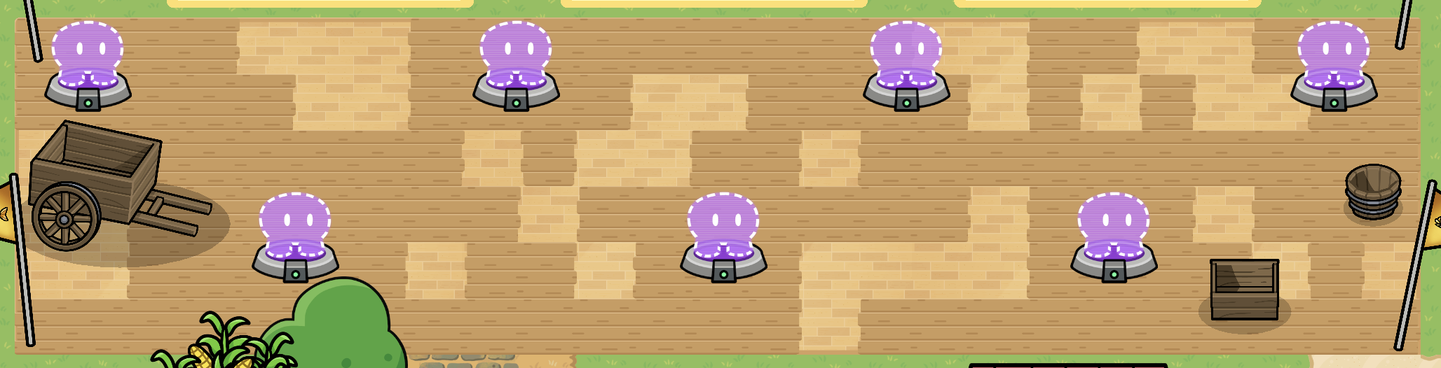
Players will be able to walk into the teleporters at the bottom of the lobby to view the different maps.
I feel like the top of the lobby looks a little bland. I don’t want it to be too busy, so that players are able to read the instructions. I’m also slightly worried about the props in the center getting in the way of players trying to check out the lobby.
I’ll be keeping this topic open until I am confident that my map designing is sufficient. I still have plenty of memory left to complete a few maps (I’m currently at 20%). Any feedback is appreciated. Thanks!
I think taking the Gimfish icons out of the title, then making a logo with them in the corners could look nice.
Can you show us what a map would look like, so we can get a feel for how big a map should be? I’d also like to know how your game plays, in case we want to add any special mechanics to our maps.
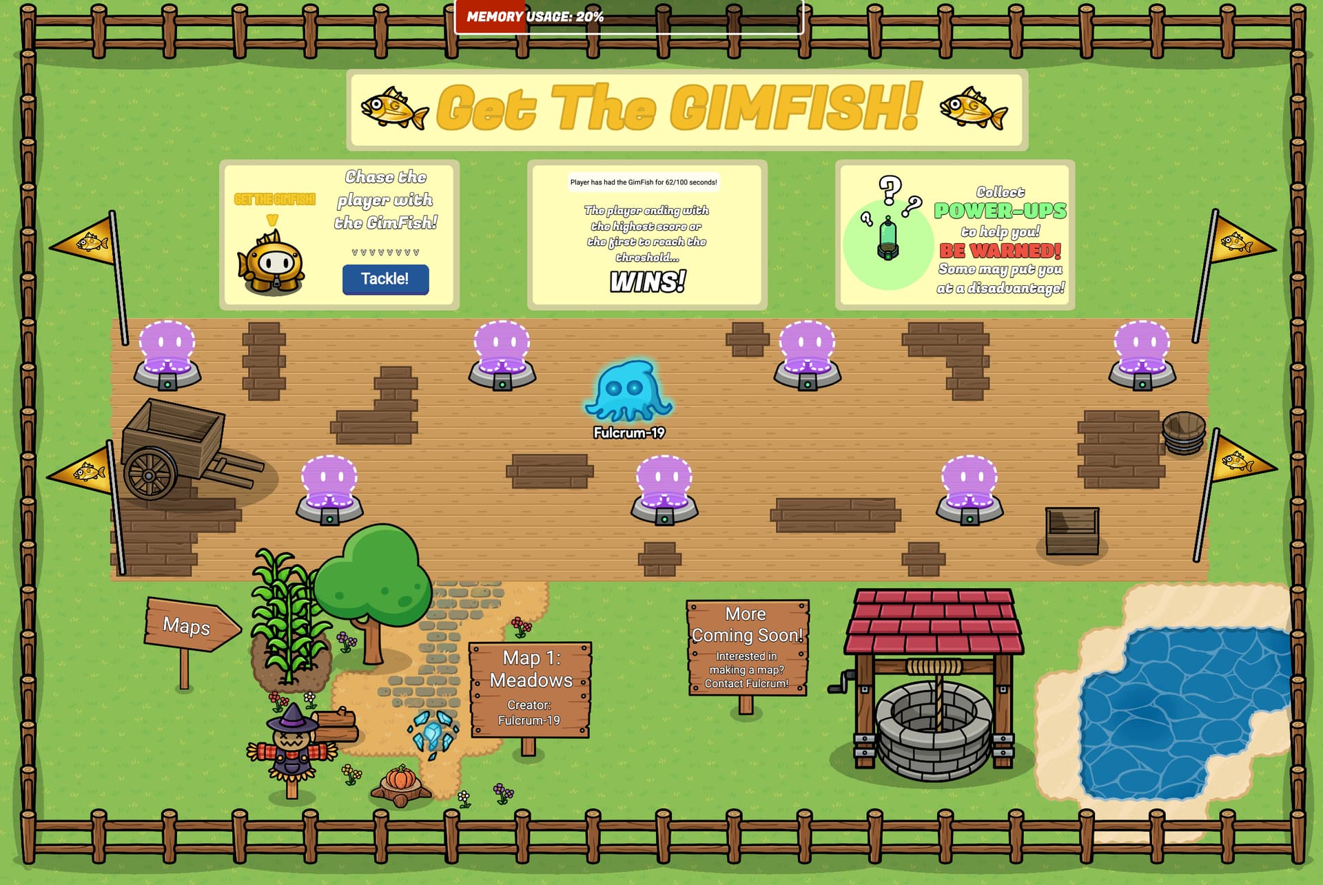
This design looks pretty solid. I used some emojis in place of the GimFish image, but I’m usually not a fan of doing that since they look different across devices. (PS, I’m recentering everything now.)
Make the grass look detailed like place Tall grass Props.
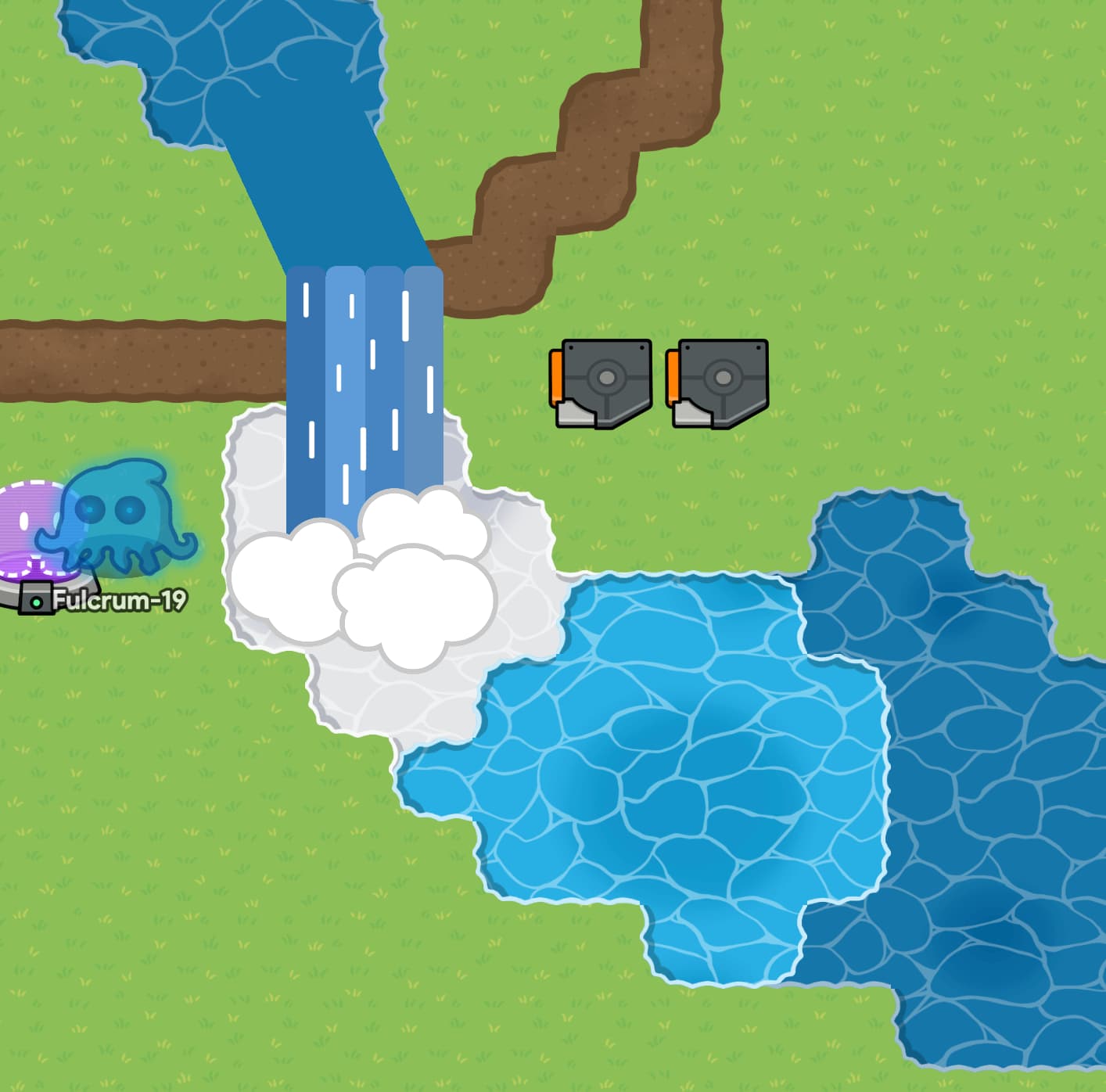
Maybe add things like fish buckets, sand pieces, etc. You know, to make it more detailed at the sand area where the pond is. Extra- add jumping fishes as well.
You should add a pile of leaves on the bottom-left corner.
You see the sign that says “More Coming Soon!” Change the color to green and the outline? (Your choice but is recommended!!) And do the same for the text “Fulcrum”
Add trails from top to the side.
Instead of a boring spawn area, (where the players spawns) make your own spawn! And then place them on top of each original spawns. Make sure they’re all invisible! for the original spawns!
Place dirt or sand around the very sides of your map.
Please make sure I’m not selling..
Anyway, hope my ideas are commendable! Okay, bye now.
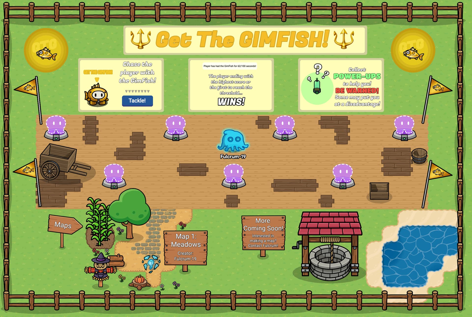
I’d vary the terrain in the center a bit more. Even though the Cracked Oak is scattered pretty well, it doesn’t blend in with the Boardwalk.
Try to keep it around the same shade, too-- the Cracked Oak is really dark compared to the Boardwalk, so something of a middle hue would help. Some lighter stuff, too.
Blastball Court, maybe?
Thankfully, we’ve got a good guide on this, so I don’t have to provide pictures lol
(Technically it’s on paths, but the style matches what I think you’re going for)
Also, tinting Alien Plant props green could be a substitute for the season ticket Grass. I use that trick a bunch.
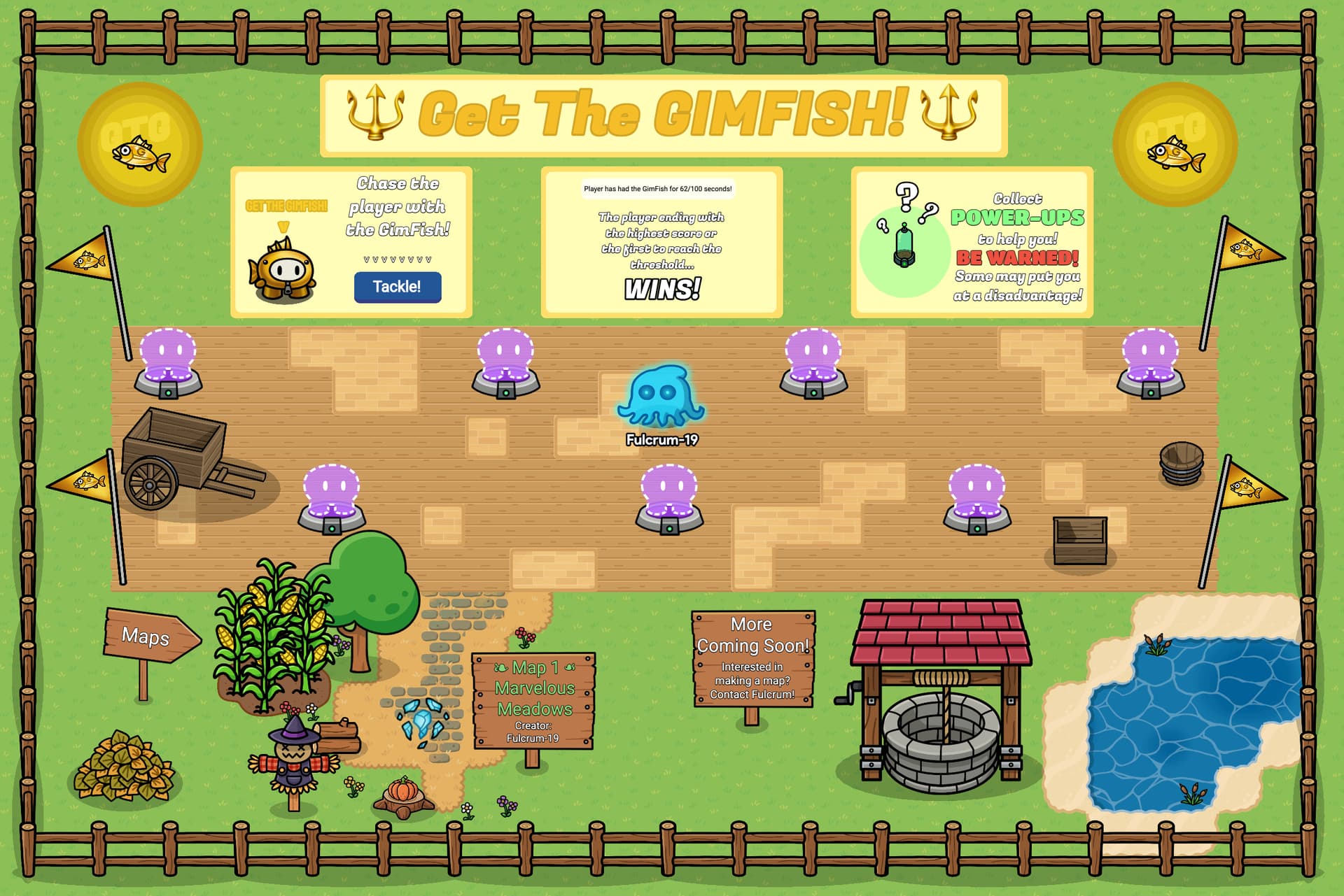
These changes definitely reshape the map very nicely! This may be enough to move on. I’ll still appreciate any feedback, but I’m going to get started on the map.
My last suggestion is to change the sign font! (Like, the signs near the bottom of your lobby.) Outfit or Fugaz One would probably suit your game the best.
Also, if you don’t need anything more, I can move this to Help for you to mark a solution.
Layer the terrain, PLEASE.
Also, try to put more decoration and effort into the floor. (gym floor and the boardwalk) Try creating crack textures by using text, using a “y” shape or something.