No, it’s a clicker game
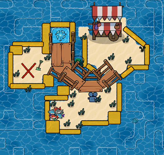
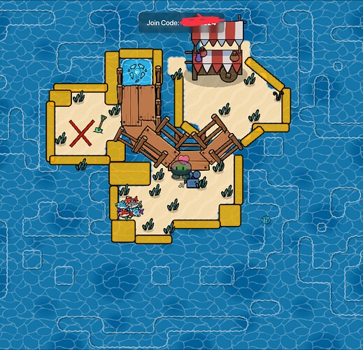
Also, forgot to mention, this part of the map is not underwater, it just has darker water because it is the ocean
Rotation grid snap.
you overdid the laying a bit
These should help:
when I hit the limit I refresh and I can place again
Try using just one layer of water instead of what you’ve got. It’ll look much cleaner.
Anymore ideas before I mark a solution?
Maybe add like a skull emoji?
Ummmm why is there a heart in there… photobomb?
The trail I have turned on right now
Oh that’s why there’s a heart!
Oh I see…
Wait I can make it look better with the new item image device!
Oh yeah… I forgot about that for a sec there…
Ok I’m trying all these ideas, I will mark a solution
This topic was automatically closed 3 hours after the last reply. New replies are no longer allowed.

