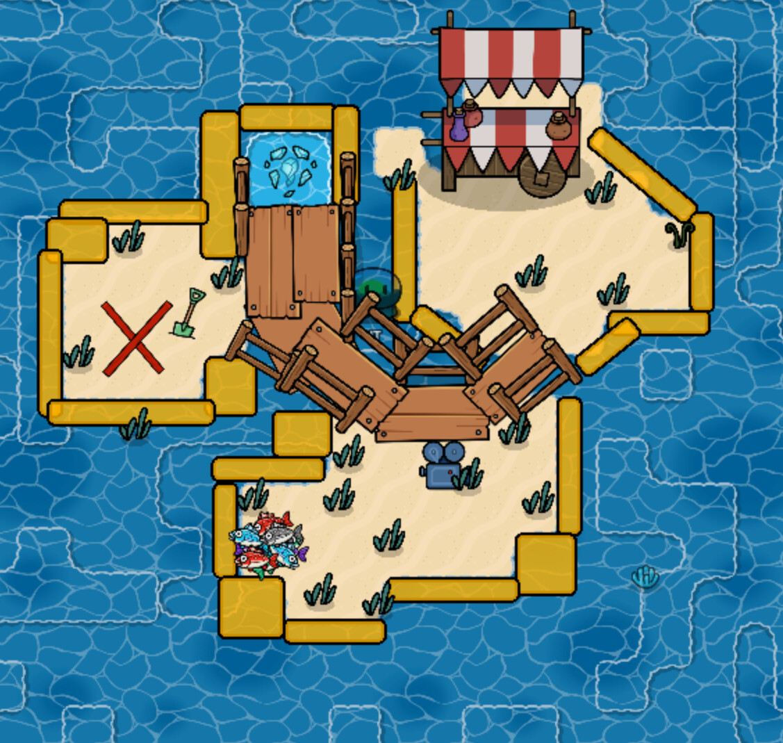
So I need ideas on how to make this area look better:
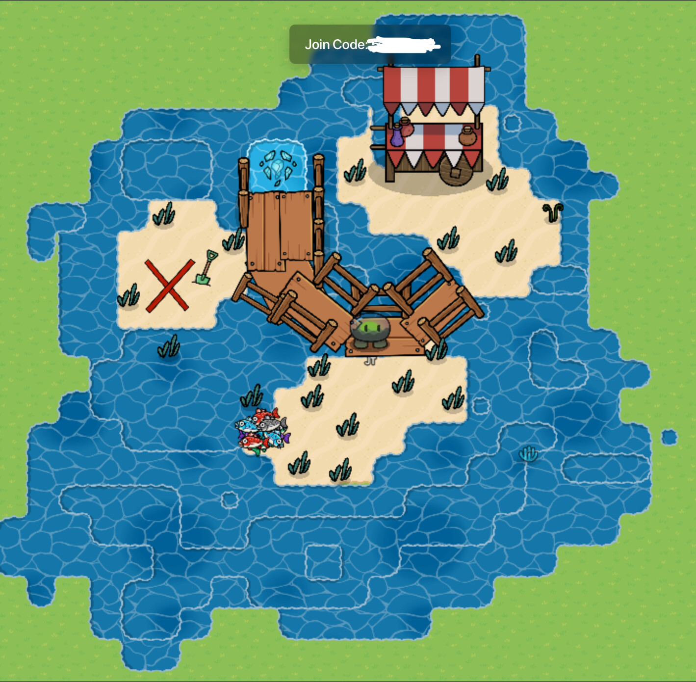
And (optional) this area:
(This is where you enter the first area I listed)
[1]
    Flowchart
         Picture 1 --> picture 2
So I need ideas on how to make this area look better:
Flowchart
Picture 1 --> picture 2
Make the grass to water area more natural, maybe?
Different water colors (light and dark) would make the water look cooler ig
more of it is what i mean
for the first one you might want to make the fences connect a little better to make it look nicer (if possible) and for the second fake the dock a little bigger and add some fish in a bucket and some barrels.
Yes, I agree
Also try making a “shadow”
ye that too
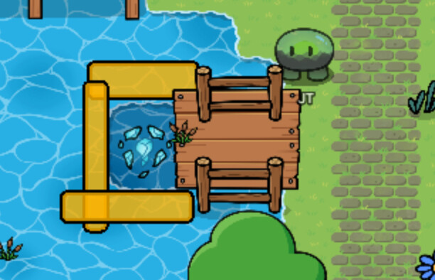
It looks like you enter and go underwater however the place you enter has grass around it. To fix this i would put gray water around (just hear me out) and transparent slightly blue rocks to make it look like ab underwater cave. Also add vines and algae on the cave walls. And starfish. Maybe tint the whole area darker too with a barrier just to get the underwater part right
Maybe add a merchant behind the market stand?
I can’t, because my game has no inventory slots so sentries won’t spawn.
And I’m always on mobile so I can’t copy-paste stuff
![]() oh… I see…
oh… I see…
is it like an island survival game
No, it’s a clicker game
Also, forgot to mention, this part of the map is not underwater, it just has darker water because it is the ocean
Rotation grid snap.
you overdid the laying a bit
These should help:
when I hit the limit I refresh and I can place again