okeh ![]()
i shall see what i can do
2 Likes
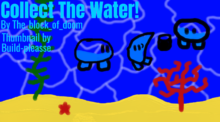
honestly i couldnt find any shaky lines that would make me look like a fool except for some from the water droplets so yeah
and messy is my middle name
rate it from 1 to 10
i dont care if you rate it low fluffy ![]()
5 Likes
Because of the layering, rendering and shading issues, I would say a 3/10 ish. Don’t let that discourage you though! I bet with practice you can improve loads. :]
2 Likes
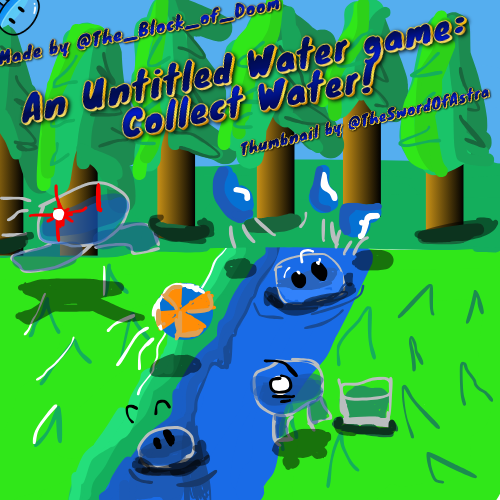
this water thumbnail gives me nostalgia.
i would change the font but idk im not an expert in fontology
3 Likes
It’s not a bad thumbnail, @TheSwordOfAstra! is this your first?
...
...
@gimkitnoobie are you sure that you aren’t prideful?
5 Likes
its the NEW KrishnaVA! and this time they’re already preparing to go to OppCon 2025!!!
3 Likes
I’d say AT LEAST 5/10. There are way worse thumbnails out there.
Like mine ![]()
getting my oppcorn for this one
2 Likes
check me bio
For opps ![]() ngl we should get back on topic.
ngl we should get back on topic.
Also @VoidFluffy , gimme oppcon tickets >:C
Also (just realised it says I hate egotistical people or smt like that.)
2 Likes
When it showing? And where?
yesn’t
4 Likes
If it was the other way around, would it be noes? Bc no, yes noyes noes?
2 Likes
I don’t wanna grasp for straws, I grasp for trophies ![]()
3 Likes
lemme add onto this:
- they can color UNDER the outlines, so the color doesn’t make the lining looks messy-and go over the outline
- bro can invest into shading more
- try doing what’s called “master studies” -look it up
~ I just realized that was like 25+ posts ago…
2 Likes
bro just votes for himself ![]()
you can’t do that
2 Likes
2/10. It’s looks kinda bad-ish.
shadows are not accurate at all ![]()