How to Make Drippy 3D Terrain! [2.5/10 or 🟦 ]

3D terrain is really cool. [1]

But you what is also really cool?

Drippy 3D terrain

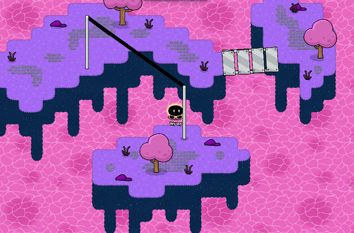
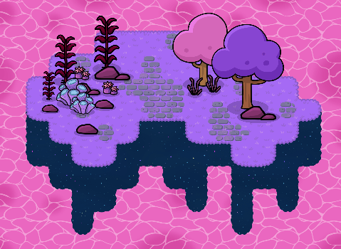
I have extensively used it before, and have shown it in my other guide. A couple games on community picks even use it.

ex.

Although it may look complicated, drippy 3D terrain is actaully very easy once you learn the simple rules.

Lets get right into it!


Table of contents:

How to make Drippy 3D terrain!

Before you start, please check out this guide to get a better understanding of 3D terrain.

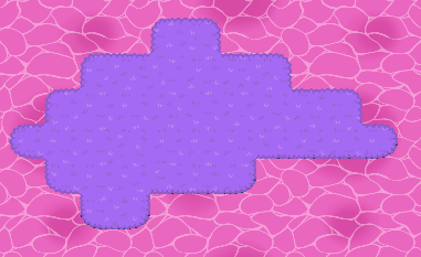
Then, follow the guide until you reach this point:

image

image

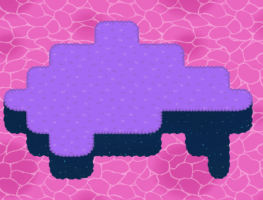
Now place a layer underneath.

Smaller islands work better with just one below, while bigger islands should use 2 below.

image

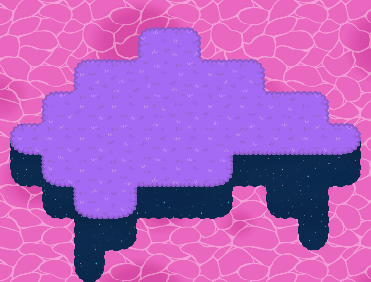
Now, lets start adding the drip.
For the general drippyness, I use these three simple shapes, as well as other structual placements to keep the shape.

image

image

image


Now that we’ve shown good shapes to use, lets apply them.
First, let’s use the 3rd shape on the right to take advantage of the space.

image

Next, let’s place a bit of terrain on the left.

image

Now that we’ve got the sides, we can add to the middle to even it out.

image

Great! looks very drippy and nice!


Yes, I know that it is a bit hard to follow. It’s even harder to explain. Drippy Terrain isn’t as straitforward as 3D terrain, and it’s more of a sort of natural, instinctual art that is more than a set of instructions that explain exactly how.

However, I have made some broad rules that will help you understand what not to do, and make you terrain look better.


Important rules!

So start off, when adding the drips, make sure to follow the shape of the island.

Screenshot 2024-10-30 3.50.53 PM

As you can see, the red illustrates the curve of the island, and the green shows how the drips follow that curve and keep it uniform with the island’s shape.

This is essential for good drippy islands, and it makes all the difference.

Screenshot 2024-10-30 3.59.02 PM - Loss of perspective, looks bad

Screenshot 2024-10-30 4.02.47 PM - Looks good, keeps perspective


The next important rule is the 90° rule.

In most natural terrain creations, it’s unwise to use 90° angle because the look unnatural
This rule applies to our drip as well, and it can look very bad if not used.

In my book, using 90° angles is fine as long as it’s less than 4 terrain units
Any more, and it looks wonk.

image

image


The third rule is the simplest, yet it makes the most difference.

IF IT DOESN’T LOOK GOOD IN YOUR EYES, CHANGE IT

It’s your map, and you get the final say in whether or not it fits. If you don’t like how it feels, or you think it’s good, go with your gut.

Do what you think is best for your map.


Bonus rule:

This might be the 100th time I’ve stated this, but please please please

LAYER YOUR TERRAIN!


Other styles and uses!

Now that you know how to make some drippy terrain, I can show you some other cool combos and designs, as well as inspiration for your ideas!

image

image

image

image

image

image

Screenshot_2024-10-30_4.49.56_PM-removebg-preview

image

image


There you have it! Now you know how to make drippy 3D terrain, as well as tips and uses for it!
I hope this helped!


  1. Σ, even ↩︎

17 Likes

permission for ranking system? y’know… this:

Ranking And What To Do Better


Creativity /10


Humor /10


Grammar /10


Explanation /10


Formatting /10


EFFORT /10


Pictures /10


Introduction /10


Conclusion /10


Title /10


Rarity /10


3 Likes

Granted!

2 Likes

Creativity: 10/10


Humor: ÎŁ/10


Grammar: 4/10


Explanation: 9/10


Formatting: 7/10


Effort: 9/10


Intro: 8/10


Conclusion: 7/10


Title: 10/10


Rarity: 10/10

3 Likes

???

Were there some errors?

2 Likes

Lot’s of periods missed, but now that I look at it, 6.5/10.

1 Like

Thanks!
please note my spacebar is semi-broken
Ranking And What To Do Better


Creativity 9.5/10
This is a 9.5 because of it being close to layered terrain, but still being an idea of its own. This is a cool concept.


Humor 10/10
this is an interesting guide without humor. In this case, LESS IS MORE.


Grammar 8.7/10
small grammar issues, not much


Explanation 7.9/10
great job explaining! no extra comment.


Formatting 8/10
could be cleaner, but pretty good.


EFFORT 10/10
has a lot of effort Putin, you wouldn’t see guides like this too much.


Pictures 9/10
not too many, not too little


Introduction 1/10
Its boring and short.I’m gonna be honest.


Conclusion 5/10
its something


Title 9/10
Cool! but capitalize make… please


Rarity 8/10
its a cool idea, not something everyone could come up with


Now, you may be saying “IsN’t RaNkINg BaD?” but here’s my argument <3

Basically, Im showing them WHAT to improve on and what they did right.
Plus I got critisism permissions from OP.

Overall Rating: 7.9/10

4 Likes

fixEdd graMEr lol


As for the introduction, I personally like it, so I don’t mind the rating

And the conclusion is the same from my 3D terrain guide, so it stays for sentimental reasons

Lol :joy:

dry as toast


Thanks for rating the guide! I’m planning on using it later to adjust some things.

3 Likes

btw this is a really cool guide <3

3 Likes

Another guide for the 3D Terrain Family! Nice job as always!

2024-10-30 7.35.54

mwahahaha you forgot to turn the shadows of the props on when placed on wall terrain
:D

ÎŁ

7 Likes

:0
what a crime

@Bardy_2913 never.
@Bardy_2913 NAURRR DONT YOU DARE @Bardy_2913

2 Likes

Oh it’s on.

The wall terrain is covering the whole shadow up :skull:


image

man I both love and hate wall terrain at times

5 Likes

@Y0ur_L0cal_Weird0, change that pfp right now.
Or, I’ma take you out of my cool list :0 @Y0ur_L0cal_Weird0


I’m so glad of what came out of that pythagorean theorem guide

3 Likes

I mean the shadow layer option lol, my mistake.
ÎŁ

1 Like

Nice guide! Thought you meant this for a sec ngl :skull: :

8 Likes

i like my terrain drippy bruh

(awesome guide!)

3 Likes

Yooo he’s got the drip on

:skull:

5 Likes

this tutorial really got me like
Screenshot 2024-10-30 9.26.41 PM
:sparkles: fancy :sparkles:

5 Likes

(post deleted by author because they made the picture even drippier lol)

Nice more to add to my guide i’m working on…

hehe… I gonna make a sky block now using barriers uncovering very Σ terrain