Heyo! It’s been a while! lol
I’ve been using Gimkit Creative for a while now, and I feel like I’ve been making maps long enough to show you some stuff!
#1 - Layer your terrain! 
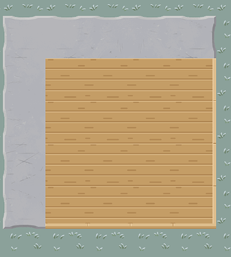
Most builds I see in Creative maps have stuff similar to this:
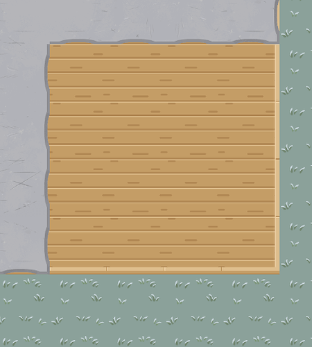
When you make floors and walls, you don’t want to use the same layer for both of them. 8 times out of 10, it will probably make your map look worse! You should make your floors a lower layer than your walls.
Can you see the slight difference in the look of the wall? This shows that the wall is wall a bit more clearly.
some walls/floors aren’t a full square when they are on different layers (like the concrete), so when you place flooring under it, sometimes it can peak on the other side. i recommend staying away from terrain like this when possible!
#2 - 3D is the key! 
Another thing you can do is give your map with props and walls!
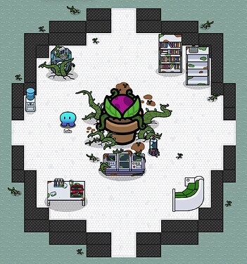
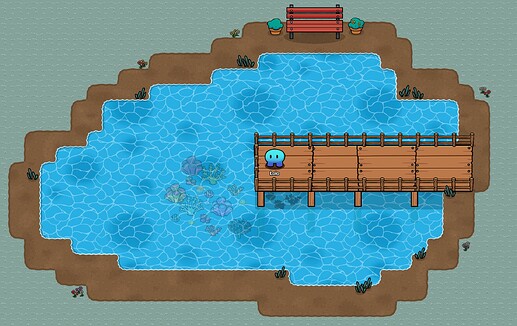
Here are two pictures of stuff I made.
I bet you can already see some 3D elements in these (and some other stuff)! Let’s break it down!
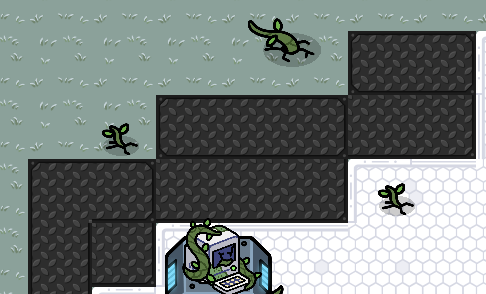
As you can see, instead of outlining my build with flat walls, I extended my walls by two, and added more wall on top (using a higher layer) to make an illusion of a 3d wall! This can really improve your builds and make them a bit more unique.
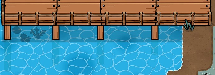
Now the dock, with the pillars! They show that the water is a bit lower than the dock, again giving the map a 3D look. This actually brings me to my 3rd tip (its a bit specific, but still):
#3 - Water Effects! 
We can still use the picture above. Look at the water under the pillars! There is a bit of a shadow I used with tinted barriers to show them going into the water, giving the maps more depth. You call also see that the shadow gets shorter the closer it is to land, which also highlights the lake going down the further you go towards the middle.
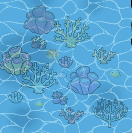
The coral in the middle of the lake is another example! All I did was change the opacity of the prop to make it look like it’s underwater.
#4 - Not enough props? make your own!
When you are making a map, you don’t want to repeat the same prop over and over again (most of the time). But what if you don’t have enough props to achieve this?
- You can use emojis using the Text device, so you can import emojis to better convey the story you are trying to tell with your map.
- For example, the pic above. I was starting to make a coral reef, but had no fish! The only fish related prop I saw was the Fish Pile (which didn’t really make sense), so I used fish emojis instead!
sadly you cant flip text, so all of the fish are facing left
- Tinting existing props!
- There wasn’t enough different colors for my coral reef, so I tinted some of them to add some more variety!
- Making your own props!
- Just because there isn’t a certain prop for what you are trying to make, doesn’t mean you have to scrap it. Usually, there are other props you can combine to make something like it, for example, the port I made using wooden signs.
#5 - Experiment! 
If you feel like something you are making doesn’t look how you want it, experiment! Try different ways to make it, and stick to your style! Just know there can always be sometime you can add or change to make a map better.
Like always, Have fun!
