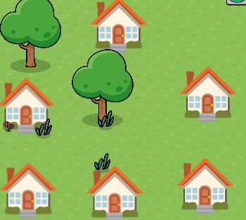
Okay… so I am trying to fix this part of my map from " The Secrets of Blue Harbor." an I have NO legit idea on what to do with this section right here:

It looks so plain and boring. Any ideas on how I can make this section look better? ![]()
Maybe add bushes with berry stickers on them.
1 Like
You could add a sidewalk or a road. Maybe some benches.
1 Like
add leaves on the ground
also tree guide
2 Likes
use more props to bring out character
1 Like
This topic was automatically closed 3 hours after the last reply. New replies are no longer allowed.