What is your thumbnail?
I’m sure it looks good.
sarcasm
i will not download it now cuz it would take up memory
(idk how to screenshot on my current device so uh… yeah.)
heres my goofy ahh thumbnail:

i await your taunting and constructive criticsm that makes my mind go up in flames
first thumbnail i’ve made for someone else’s game
dont expect me to be so good at computer drawing.
11 Likes
If you don’t photoshop (unless it’s actually good and took time) and you put in effort into your drawing, then I think it’s great. Doesn’t mean it won’t be criticized. But it’s not the worst. My first thumbnail… was… very “pretty.” Just keep practicing!
2 Likes
i use a old computer for this
press F to pay respect to my fingers…
i’ll just let the community decide on this one
- Fluffys thumbnail
- Gimkitnoobie’s thumbnail
0
voters
@here apologies for ping, but i would like to resolve this issue once and for all :]
2 Likes
That’s the actual color the sky is ![]()
And credits will be in the game description, I believe.
If credits are too large it will take away from the art.
Also, I know what I’m doing.
Not to flex, but I won 3rd place for the Gimkit Awards in Fanart- aka drawing Gimkit related stuff.
Seems like you’re just grasping for straws.
3 Likes
fluffy do u like my thumbnail
i really want the thumbnail god to look at it and decide
It’s kind of messy.
Try experimenting with layers to make the lineart above the coloring, and take your time when making each line.
To make them smoother, you can turn on smoothing or stabilizer in your settings.
Search a few yt tutorials on making your art cleaner and smoother.
3 Likes
okeh ![]()
i shall see what i can do
2 Likes
honestly i couldnt find any shaky lines that would make me look like a fool except for some from the water droplets so yeah
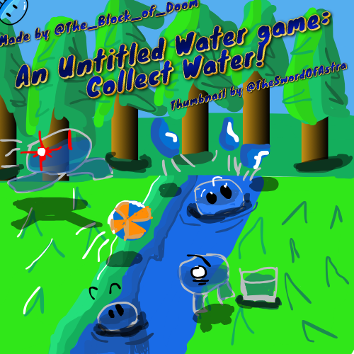
and messy is my middle name
rate it from 1 to 10
i dont care if you rate it low fluffy ![]()
5 Likes
Because of the layering, rendering and shading issues, I would say a 3/10 ish. Don’t let that discourage you though! I bet with practice you can improve loads. :]
2 Likes
this water thumbnail gives me nostalgia.
i would change the font but idk im not an expert in fontology
3 Likes
It’s not a bad thumbnail, @TheSwordOfAstra! is this your first?
...
...
@gimkitnoobie are you sure that you aren’t prideful?
5 Likes
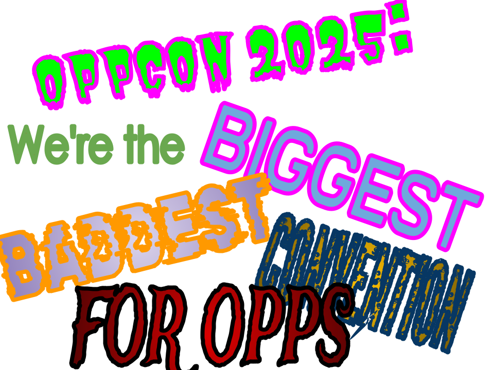
its the NEW KrishnaVA! and this time they’re already preparing to go to OppCon 2025!!!
3 Likes
I’d say AT LEAST 5/10. There are way worse thumbnails out there.
Like mine ![]()
getting my oppcorn for this one
2 Likes
check me bio