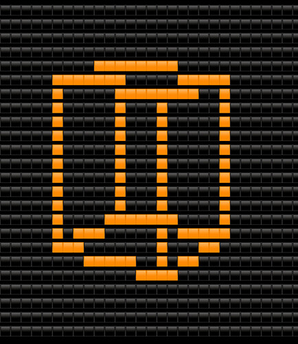
I’m sure most of you have seen a text display before, but if you haven’t, they’re pretty simple. A row of emojis that together, act as pixels and display an images. You can see some examples here:
I’m making this research topic because I want to find the best possible text display, capable of displaying the most colors as fast as possible. The text display I have in mind would have an API that allows you to quickly draw a circle or polygon onto it, with little to no lag so that you can render a large amount of shapes at once. If we can create a good text display and rendering API, the sky is the limit in terms of custom games.
Unfortunately, pretty much the full development of text displays has been done by me, when I’m bored, in my free time, and I want that to change. I think that a lot of the methods I’m using could be improved, which is why this has been posted here (so that people can improve them). I’m gonna detail the two methods I’ve used for my projects in the following dropdown, so that you all can see where I’ve started at and have something to base new ideas and modifications off of.
The method
Alright, so this is the current most advanced text display that’s been made, and it’s pretty simple (the bar for “most complex” is sadly rather low). The text display consists of a column of text objects, each of which display a row of emojis. The emojis I use for pixels are “![]()
![]()
![]()
![]()
![]()
![]()
![]()
![]()
![]() ”. (Note that the Black and White squares are slightly smaller, I had to do this because all the other squares are two characters long, while the white and black large squares are only one. Using the smaller squares fixes this.) The text objects then load the emoji’s they are supposed to be displaying from a property that has been rendered from an API.
”. (Note that the Black and White squares are slightly smaller, I had to do this because all the other squares are two characters long, while the white and black large squares are only one. Using the smaller squares fixes this.) The text objects then load the emoji’s they are supposed to be displaying from a property that has been rendered from an API.
The only API I’ve ever used was a bad implementation of Bresenham’s Line Drawing algorithm. It would loop over each pixel in the line, and set the corresponding pixel in the display property. It wasn’t very fast and in my 3D renderer actually takes up the majority of the time spent showing each cube image.
The limitations of these methods- only 9 colors, only draws lines, and very slow.
So… how can we make a better text display and rendering API?

