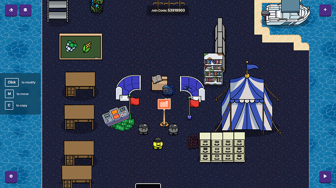
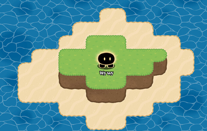
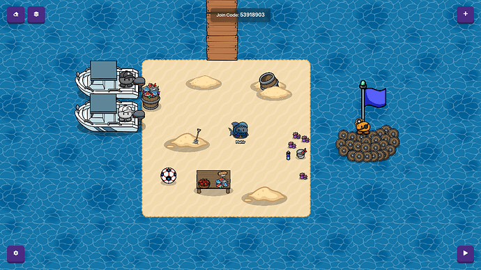
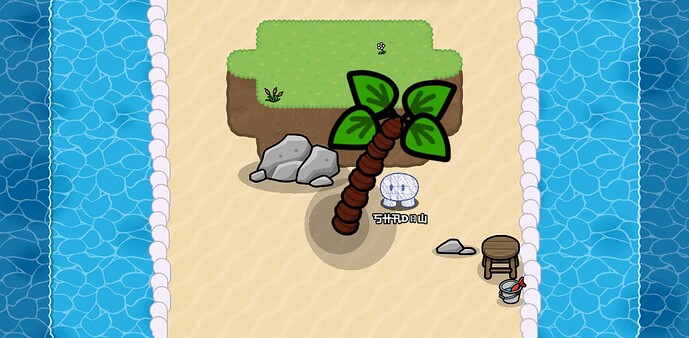
Erm…
Spawnpads
plants on the water and on land
grass maybe?
maybe piles of sand and coral
other beach-y props
likes
I Forgot About that sorry ![]()
I didn’t put as much effort into this one as my other ones, but its still pretty good.
Put the grass on a higher layer.
Also, try adding some 3D terrain!
Oh and make the island less “square” and more “natural”
Lol I keep re-editing this post
Try adding this
Oh I Used The Terrain On 5
Welcome to the Gimkit forums!
takes everyone ideas and smashes them together
I’ll add more later.
But Niblet, it would probably be wise to mark a solution to close the topic since you have a ton of ideas given to you
Mmm tasty terrain!
I love the water and the shadow for the tree!
Wait How Do You Mark A Soltuin Because THe Solution Box doesn’t Appear
Btw Im In School Rn
its art there isn’t one change it to help
Welcome to the forums @Niblet_The_Hamster!!!
Make sure you read the TOS and FAQ!!! You get a badge for it ![]()
Well here it is, I suggest making the island(sand) part bigger so its not so crowded.
Dark Blue Water Layer 1
Light Blue Water Layer 2
Sand Layer 1
Dirt Layer 2
Grass Layer 3
Seafoam is: ![]()
Coral is shaded with a non-collision barrier on top of it.
Palm tree;
How to make a good looking Palm Tree in Gimkit Creative (Difficulty 2/10 or 🟦 )
Some Art topics can have a solution box, but apparently this one doesn’t, so if you really want to close it, you can
- Move it to help and mark a solution (or have someone move it to help for you)
- Wait for Blackhole to come along and close it for you (if you want)
Agreed
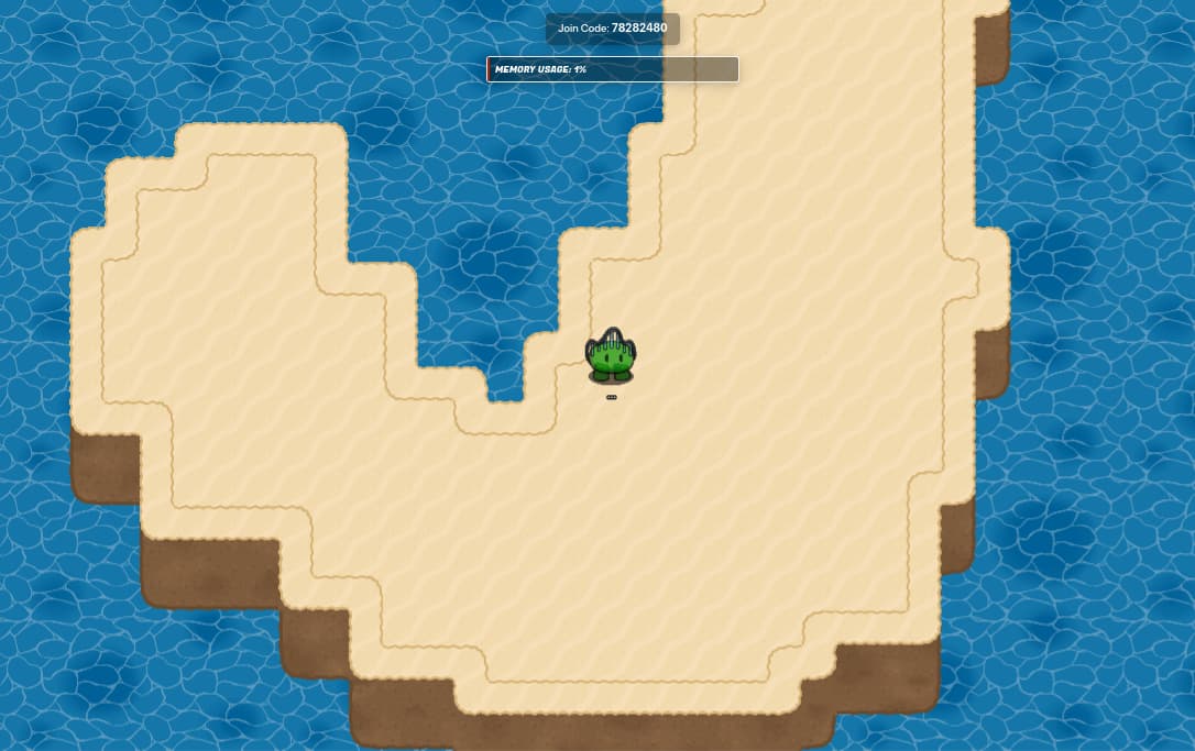
So far, I think the biggest issues I have with the lobby are:
- The “Island” is quite literally a rectangle.
- The props feel randomly placed without meaning.
- The coral doesn’t look underwater (yes, you can fix this).
- The layering at the part with grass.
So how can we fix these?
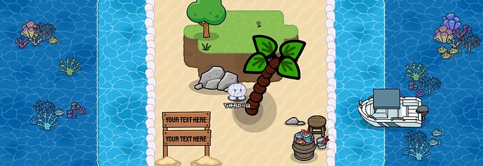
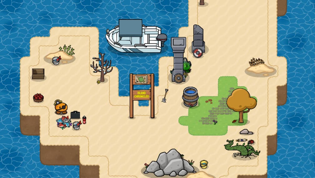
For number 1, I made the island 3D and have a funny curved shape, then traced the border with sand:
Also, the game code doesn’t work
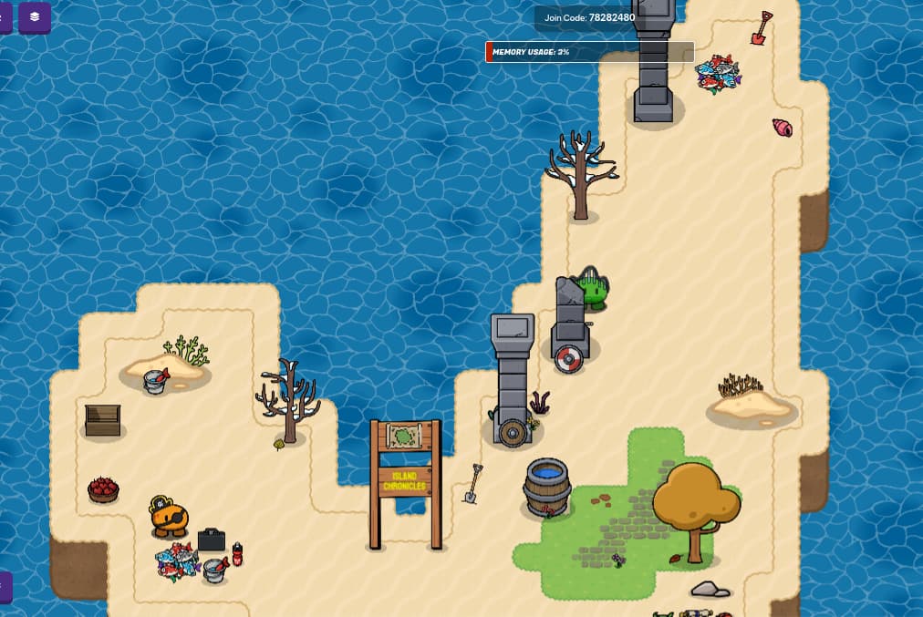
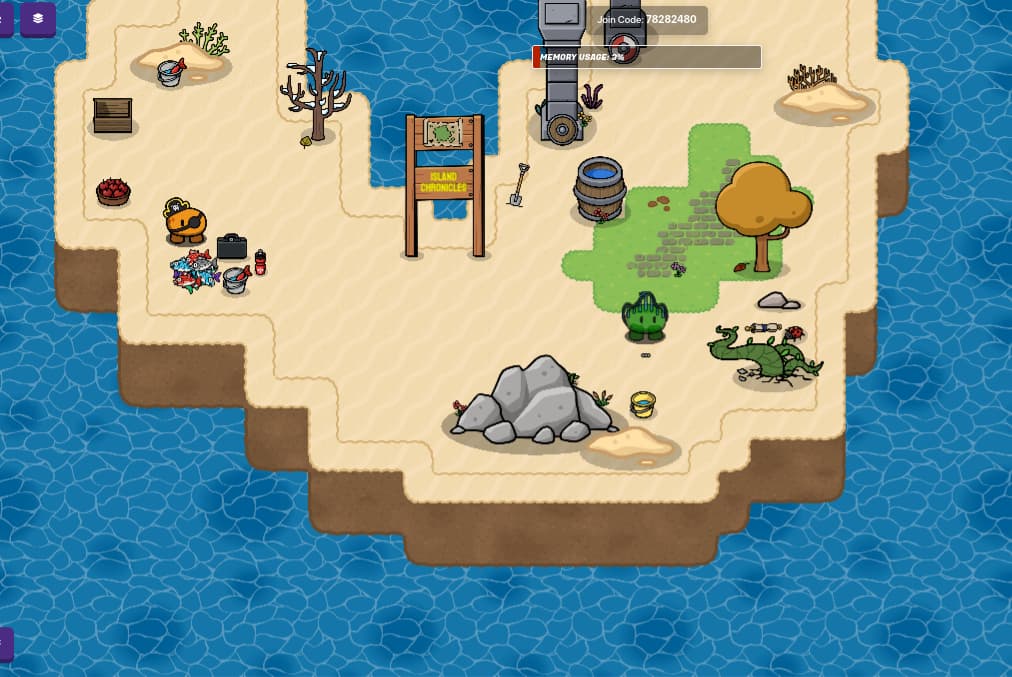
For number 2, I’m just going to decorate the island myself, and let’s see how it goes:
Woah! That was fun! Alright, I’ll go through all the changes here. First of all, I made a sign (3D sign, if you don’t know how to do this, use the same method you would for 3D text) with the game’s name on it. Then, I added a sentry with some materials, and some misc. decoration. Also, I fixed the layering issue. Now, the grass is on layer 4, so it looks more smooth! Alright, final part (because I did 4 and 2 at the same time).
For number 3, I didn’t include coral in the water, but what you would do is put a semi-transparent barrier over the water to make it look like the coral is under the water. Okay, I also added a boat here:
And a fish barrel (which granted, looks kinda dumb but who even cares?)
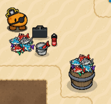
Which finishes the design. Hope ya liked it.
P.S: You can put the ball anywhere, I forgot about it.
Keep in mind that this is still a pretty basic design - you could add structures surrounding the island, bubbles in the “ocean”, even more decoration (as long as it doesn’t block the path of movement), and so much more. Heck, you should play “The Forbidden Islands” on discovery (by our dear friend who has unfortunately left, @Wumpus) and take inspiration from that. The islands there are much better than the island I made.
