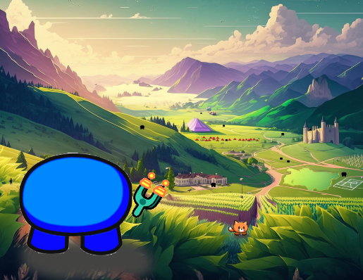
Hello, I’m Kadenracer987, An I recently made this thumbnail for a new battle Royale game I’m working on. Can you rate this thumbnail? and I got rid of the title to prevent spoils anyways here it is!
- 1
- 2
- 3
- 4
- 5
- 6
- 7
- 8
- 9
- 10
Thank you!
Hello, I’m Kadenracer987, An I recently made this thumbnail for a new battle Royale game I’m working on. Can you rate this thumbnail? and I got rid of the title to prevent spoils anyways here it is!
Thank you!
EDIT: MY BAD ON THE TITLE PART
but the tiny gims could be a good idea
Yeah, I was thinking of that and the structures in the image represent actual things in the game
yea that is a good idea
gim on top does look fire though
Yeah, took alot of editing
no question marks and spaces. Just letters only.
10/10 it looks kool
maybe a little more going on in the background but it’s good!
Oh hey, welcome back Puffy!
Glad your back! ![]() Just realized I forgot to welcome you back! Saw you on the discord!
Just realized I forgot to welcome you back! Saw you on the discord!

![]() there we go looks better
there we go looks better
funny idea: Make a gim falling off the castle lol and have the 100 damage mark like in Fortnite.
I’ve been scared to open the forums. also thanks, and I saw you too!
ok, your barely gonna see the 100 though
I love it but maybe move the gim to the other side cuz if u look closely its the shading is incorect and doesn’t match the fields
the dodge? is that the gim your talking about?
Yeah, I would too. Banned, vaporized, hated, loved, welcomed, many possibilities .
But glad your back!
And also, I think that’s all the ideas I got for the thumbnail. But the thumbnail overall is gives a nice look! I would say it is a 8/10, great thumbnail!
thanks. I worked hard, even though I used Adobe firefly for the background, and that was a challenge on its own