I got like 2 threats from random people on the forums but its funny to see them type there hearts out for a threat.
(on my email not forums)
lol, that’s funny all that work, just for you to delete it
ok, I’ma now add the solution
I wouldn’t mark your own post as solution…
lolololol
“mods delete that post”
anyways, I apparently got news from gimsolver theres an inappropriate account, so ima go vaporize it! ![]()
oh ok I will not do that
but look at the difference
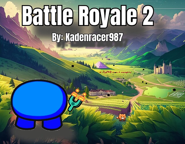
The background doesn’t really fit with the style I see and the slingshot just feels wrong. It’s pretty good tho
Also on the title, it’s off center and the font could be changed
k thanks for the info, and the background is all the buildings in my game
I also see the tiny gims you out there, however the one on the hill doesn’t look right
agreed, very much agreed

see the difference?
and cool fact, the fog out there is the storm, because I was able to make the storm
ok I’ma do the finishing touches on my thumbnail and game see ya
this one the gim that is standing the shading on his body is incorrect and doesn’t match cuz it looks like he looking at the wall
I know, I flipped the shading on the blue gim
but yes, I will change it
why then…

