Intro
This is going to be a simple and short guide that will help you use Text Devices in Gimkit Creative so you can make the best out of it. Texts seem really boring and simple, but they can do a lot of things!
Fonts
Fonts
Now, many of you might know this, but some people don’t. There are different FONTS in a Text Device.
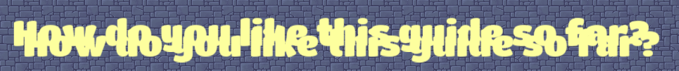
The default setting of font is Rubik, which is like Arial in Google Docs- it’s not really great for a POP. This is Rubik:
This is all the font types in Gimkit as of Feb. 2024:
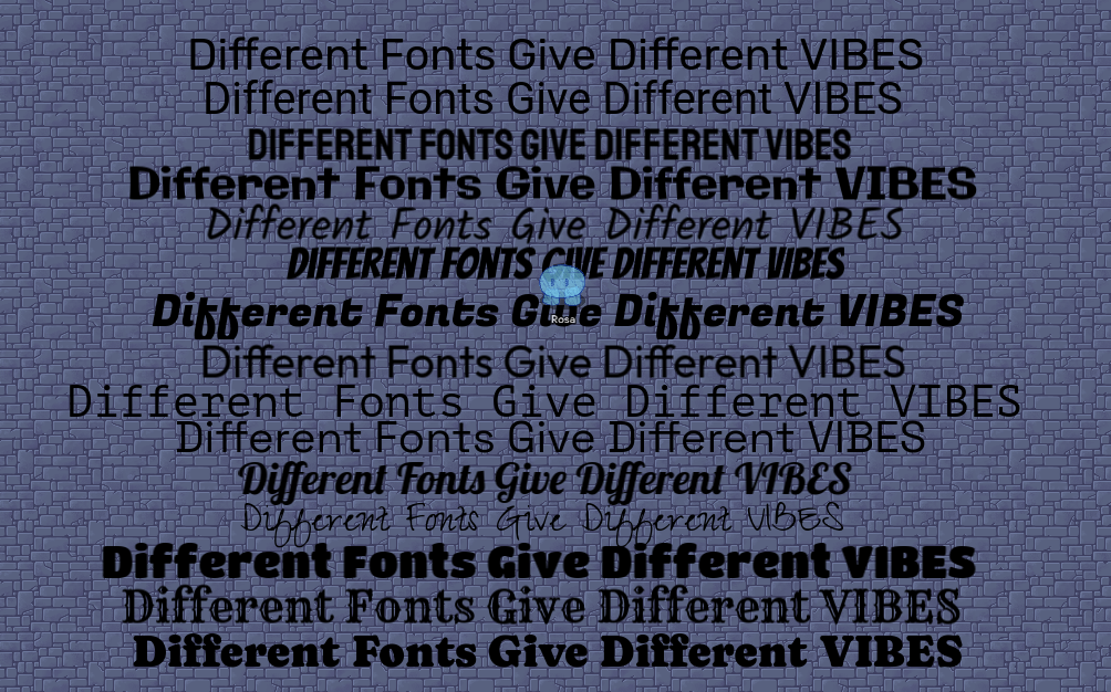
In order of:
-Rubik
-Roboto
-Staatliches
-Galindo
-Kalam
-Bangers
-Fugaz One
-Outfit
-PT Mono
-Space Grotesk
-Lobster
-Zeyada
-Titan One
-Rye
-Caprasimo.
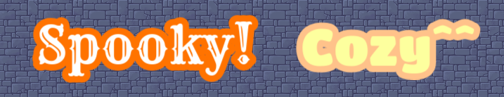
The variety of fonts could be used for different themes; for example, RYE gives a pirate-like feel, while OUTFIT gives a cozy feel. LABSTER is fancy, and TITAN ONE is cute and bubbly. I think Gimkit’s constantly updating more fonts, so there may be more in the future!
Outlines
Outlines
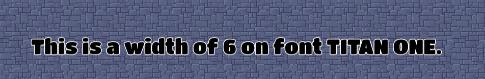
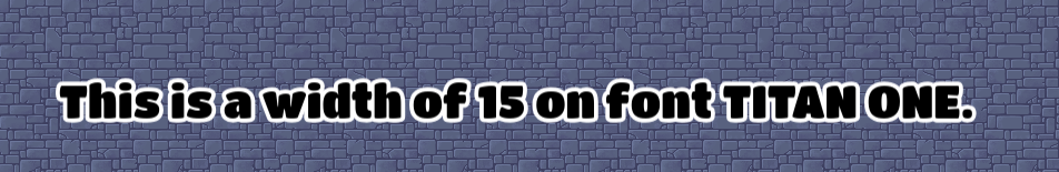
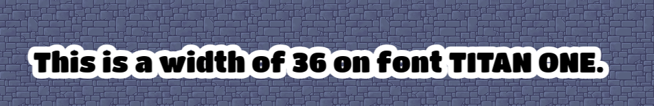
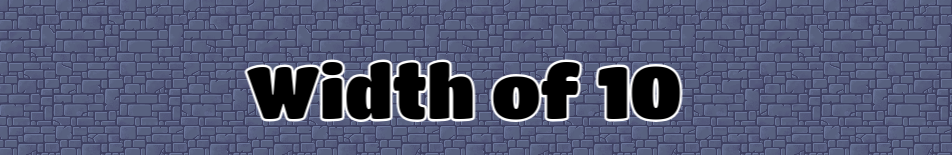
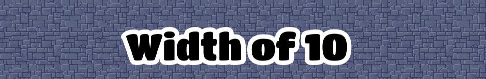
This is also probably commonly known, but I don’t think many people use this. In Gimkit, it is described as ‘strokes’. For a font size of 80, I found 4 to 8 to be a thin outline, while 15-20 make a cute bubbly feeling, and 36, aka the max width, is basically giving the text a background. You can change the colors, too.
Font size 80, stroke width 6:
Font size 80, stroke width 15:
Font size 80, stroke width 36 (MAX):
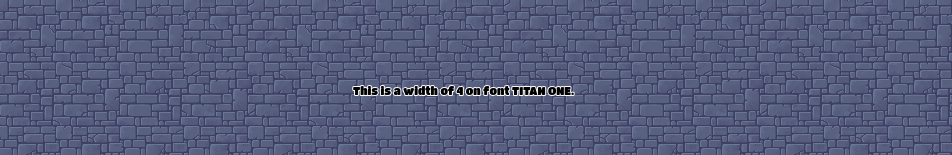
Font size 22 (Default), stroke width 4:
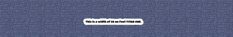
Font size 22 (Default), stroke width of 36 (MAX):
Font size 144 (MAX), stroke width 4:
Font size 144 (MAX), stroke width 10:
Font size 144 (MAX), stroke width 36 (MAX)
And I’m very sorry if the 22 is a bit small, but I wanted to give a clear representation of the font sizes to each other- this is all screen-captured to scale.
Change the colors of the strokes for a different vibe!
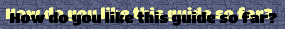
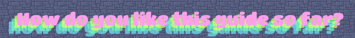
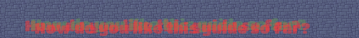
Shadows
Shadows
If you want a cool shadow effect, then follow these simple steps!
- Choose a chunky font. If you choose a font like Zeyada, then chances are your shadow won’t look very good. Here’s a list of chunky fonts:
Rubik
Staatliches
Galindo
Banger
Fugaz One
Titan One
Caprasimo
-
Write your text.
Pretty self-explanatory.
-
Copy and paste the text. That text should overlap the original text, but not completely.
Make the shadow color dark.
Make it translucent- I find alpha of 0.7 OK.
-
Go to ‘LAYERS’ and make sure the shadow is behind the original text.
-
Fiddle with the location and the angle a bit. You can make multiple shadows for a cool pop effect!
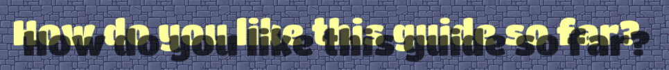
This is a glitch effect gone wrong:
Emojis
Emojis
Now, pretty much everyone knows this, but I’ll say this just because. Right-click on a text device and click ‘Emoji’. You can choose any emoji, and this is useful for stuff Gimkit doesn’t have as a prop. These are examples I’ve seen a lot:
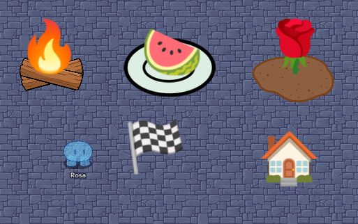
But I thought, why stop there? What if we used a human emoji? And this is what I came up with:
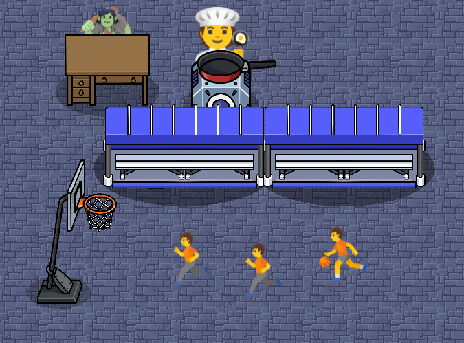
This is just the surface of what we could do with emojis!
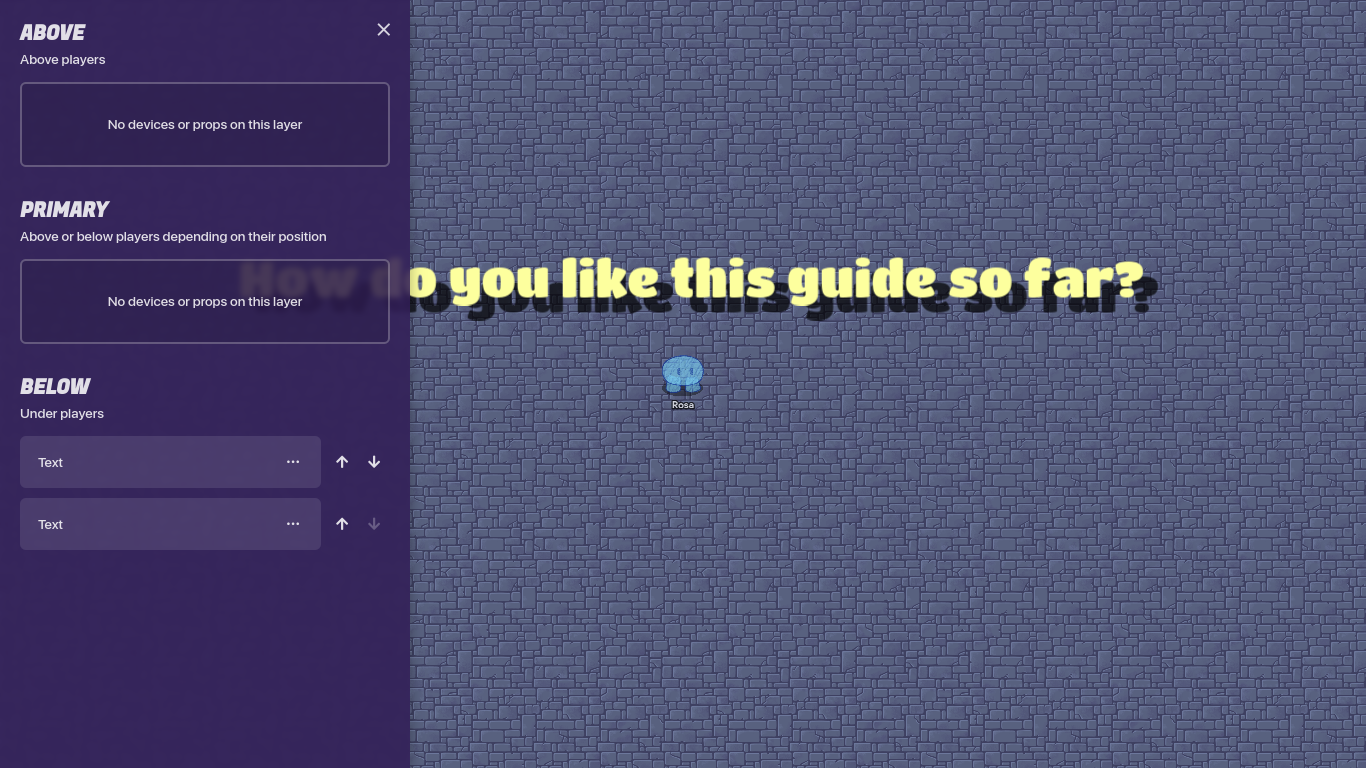
Outro
Thanks!
- Yes!
- Really.
- Nope.
- Not even a BIT!
- Kinda
- Want a second part!