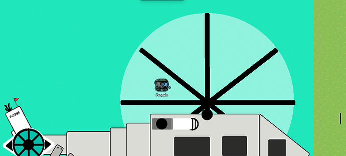
Today we Launch into space with Caternaught and create a Helicopter!
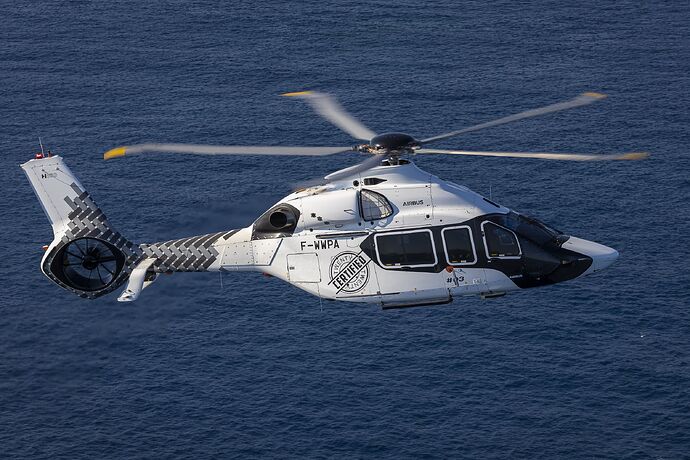
When Creating this guide, we will focus on making this Heli:
You can choose any color you want, but I want to use black and white.
The Back (Step 1)
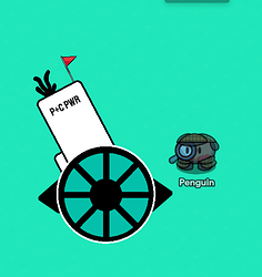
To make this Helicopter, we need to start with the fan In the back. This:
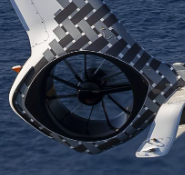
Create a sleek black border as a subtle initial barrier. Inside this border, introduce a smaller circular barrier, painted in the hue representative of your desired background color. If envisioning a tranquil light blue sky, ensure the inner circle exudes the same serene light blue ambiance while retaining the outer black border for a polished finish.
This is the result it should be:

Add a small barrier on the inside, and add metal poles all around to create the fan.

Get two dark wooden signs, and put them on the edge of the fan
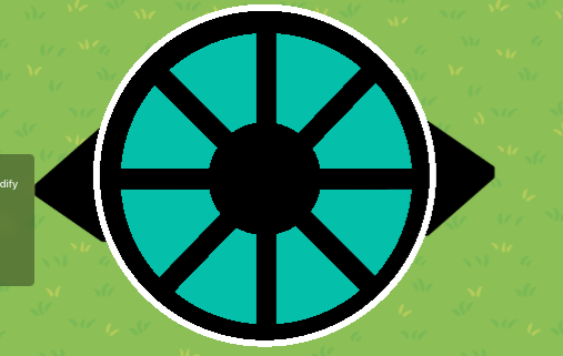
when you’re done with that get a rectangle barrier and resize it to look like this:
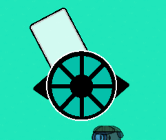
Add another small barrier to add complexity
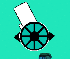
When you’re done with that, add some props for decor
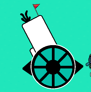
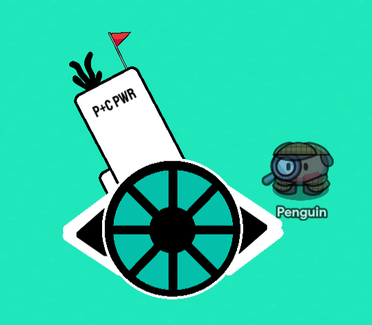
You Can Even add text to name the heli!
(it stands for Penguin + Caternaught POWER)
When that is complete, try adding 4 barriers on each side of the sign. Like this!
For this part of the heli, we need a few things
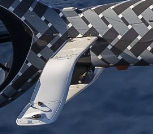
You could use barriers or metal signs, but you need four of them.
If you use Bariers make sure to add text for some decor and complexity.
Either way, the result should look like this:
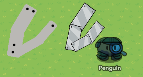
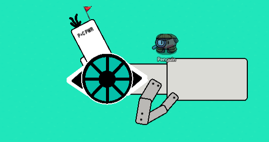
make sure to attach it to the heli after adding… THE NEXT STEP!!!
So now we need a whitish barrier to make sure it doesn’t blend in with the others:
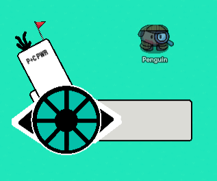
copy the barrier and resize it:
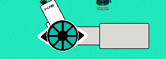
Ta DAAAAAAA! We finished the back!
The Base (Step 2)
The base is kinda short in steps, so bear with me.
For the base, You need A LOT of barriers resize and move them as you please, this is your build ![]()
I worked hard and came up with This!
You Can Update yours as you please but this is the main base I came up with.
When coloring, make sure that the colors match the tail. These are the colors I used
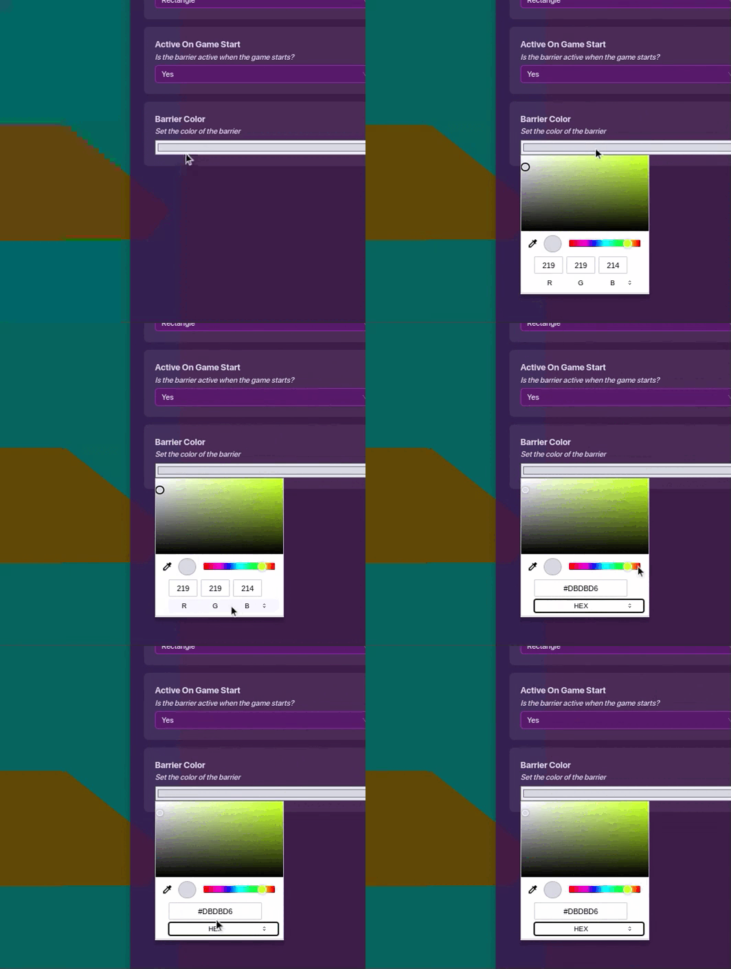
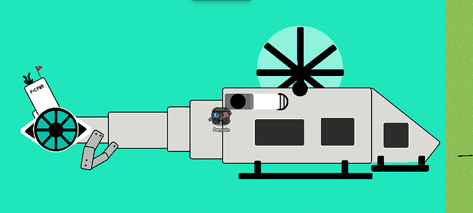
This is how it turned out:
Now add 3 black barriers with 0.80 transparency (the default) and place them like this:
The windows are done so now for the details!
Add 4 barriers, 2 circle 2 rectangle.
One rectangle is black at 0.50 transparency and the other is white with transparency as 1
the circles both have borders while the rectangles don’t. One circle is pure black with 1 as transparency and the other is white with 0.01 transparency. Get and shrink some poles and tint them black to put in the white circle
This is the result:
It represents this:
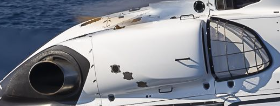
Now Get three barriers, and resize them with the color of your choice. this is the Heli’s steps:
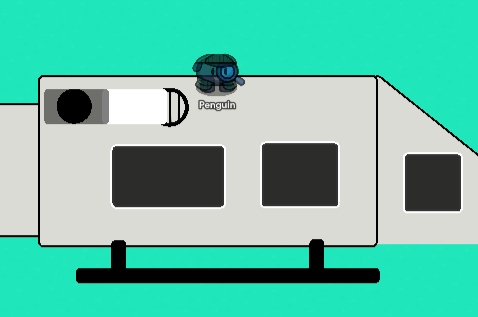
Now copy that and make it smaller
When that’s done get a lot of barriers (2 circle the rest rectangle) and resize them to look like this.
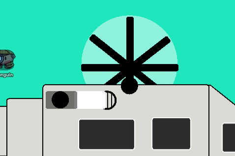
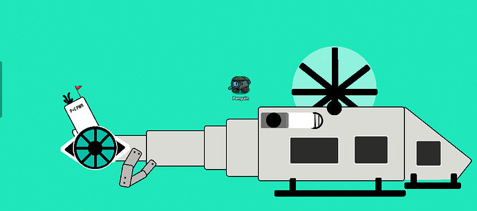
THIS IS THE FINISH!!!
Tips/Ideas
- Add small Details to make the heli more complex
- Use as many colors as there need to be
- Make it so that the window can show your character inside it
- Add Text to show your ownership
Credits
Credits to Coffee for the original
How to make a helicopter
Caternaught Quote of the day
Look up to the stars and Blast Into Life!
It took days to make so please enjoy!
