Now that youve done it reply with a picture of how yours turned out and if something went wrong (size) i couldve have done it on perpouse just so you can fix it
Maybe format this into dropdowns? That way it could be easier for people to find the exact part instead of just scrolling, otherwise this is pretty good.
Use dropdowns to organize it better. Also, make sure to get the image placement right, some borders would help so it’s not just splotches of color.
Also fix the grammar it’s driving me crazy
One suggestions: try using dropdowns to organize your steps. Naming your steps will also help. (If you don’t know how to make a dropdown, type this )
[details=Name of section]
#your code here
[/details]
Heh, guess everyone’s saying the same things, lol. Also could you remove the “(Also this is my first guide)” from the title? It’s not important to the grand scheme of things, so it shouldn’t be in your title. You could put it in the body though. (I would’ve done it but alas, no tl3 for me )
Edit 2: Going through one more time, a couple more suggestions for you:
Finished product - put it at the end maybe? No point in putting it in the beginning…though, as this is an art-guide , I’ll let it pass
As Ars said, the grammar needs real fixing man. I know you probably typed this up in like 10 minutes (not including picture taking), but still. You gotta act like you’re sending an email, and grammar and spelling have no exceptions to be excepted.
As I said, [details=name] section diving.
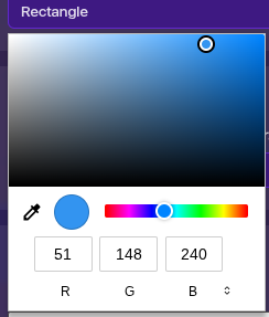
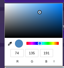
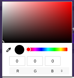
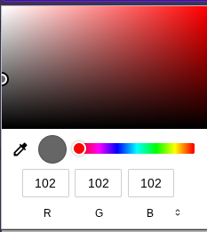
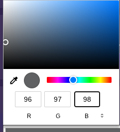
You probably see people say in other guides, “add more pictures!” but nonetheless, too many pictures is still . With this many pics, even with [detail] blocks, it’s still gonna be a messy read for the average person. Consider using words to substitute things that you visualized but didn’t need visualization - for example the color picker you could just say
this just gave me an idea, what eef i just give gims different speeds when they turn to simulate a car turning? (but then again i forgo how much keybind systems one can have before it turns tricky :/ then again i could just use the coordinate device and some formulas)
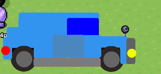
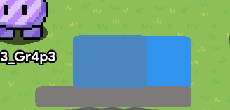
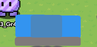
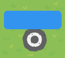
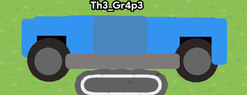
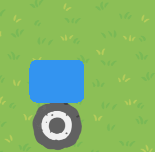
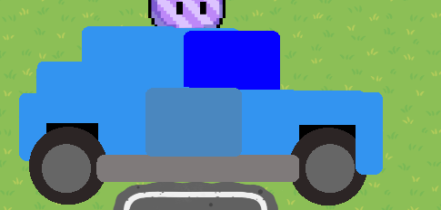
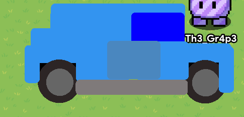
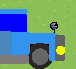
A small idea is to instead change the tiny bicycle rack to a metal pole. I don’t know if this will make any difference but I think it would look nicer in the final finish .
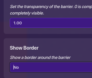
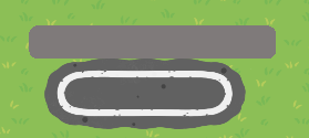
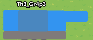
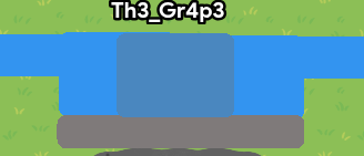
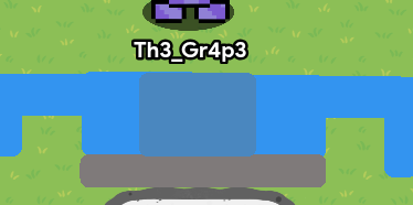
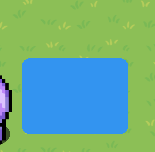
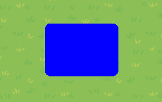
Hold on–I just realized. If the colors are optional, like was mentioned in the OP, the images showing what colors to set the barriers to are unnecessary. Deleting those would make the guide a lot neater and easier to read.
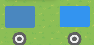
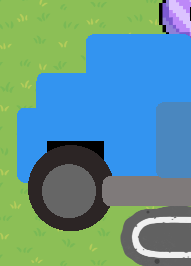
Also, maybe try using layers to make the wheels pop in front of the body instead of behind, and use some shading and perspective also.
I’m going to be honest:
This guide just isn’t good.
Here’s some things you should improve,
USE DROPDOWNS! They are fundamental to making a good guide.
Don’t make unnecessary steps. You showed us colors despite saying its’ all optional.
Better grammar. Colons (:), Semi-colons (;) and Hyphens (-) could’ve been used throughout this guide. There were even missing Periods (.) and that really took away. Capitalization was also missed throughout the guide.
Overall, this guide is just bad. I would suggest just fixing everything while you still have edit time. Check out other guides (or even this guide) to get a good idea of how to make a good guide.