what i am going over: i am going to be going over the basic’s of shading and how it can be very effective for everyone’s art! Not all people have to do/follow this guide. You can just read it for fun or just a tip in art.
☀️—Basic Lighting—
Most things people forget to add is light/proper lighting.
When it comes to lighting you want go with the person/object in your art. If your
making a sunset and you add a person/thing pointing/looking at the sun you want
to add a Shadow or Dark Point

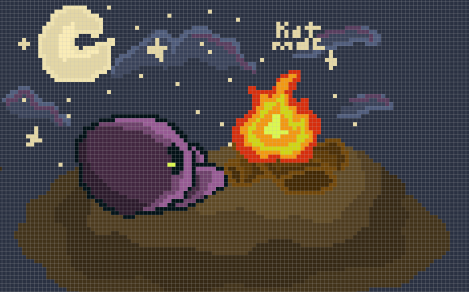
Let’s use this simple drawing as an example. You have a little gim shading near the
sun. Here is 3 Sanrio’s.
- There is no color
- There is color but no shading
- There is color and shading but the shading is just not right.
- There is no color
- There is color but no shading
- There is color and shading but the shading is just not right❓
1 is wrong because you have no color to your gim therefore, there no life or detail to your drawing.
2 is wrong cause you added life to your drawing. There still is not detail.
3 has a question mark because you added both life and detail yet you added detail wrong. Here is what i mean by the example below:
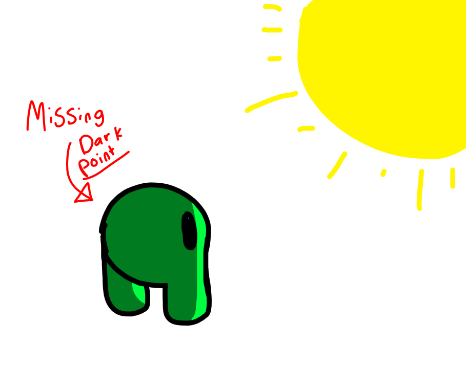
Exmaple 3 is missing the dark point, and light point detail of the drawing.
The light point is the point or center of light diffusion in the composition of a painting, or the luminous part of a painting in relation to the shadows .
Value is one of the basic tenets of art. It refers to how light or dark a color is. For example, white is the lightest value and black is the darkest value.
If we were to add the dark and light point of the drawing it would make the image pop out more and have more life and detail to it. Which makes the drawing look more put into it.
Before we move onto the next part of this guide please note that. I am not making fun of anyone who doesn’t do this, or doesn’t do this correctly. I don’t want you to feel bad about your art in any way. This guide is to help people who struggle with shading and adding detail to their drawing piece.
—The next topic i will be going over is the concept of color in shading.
shading with color
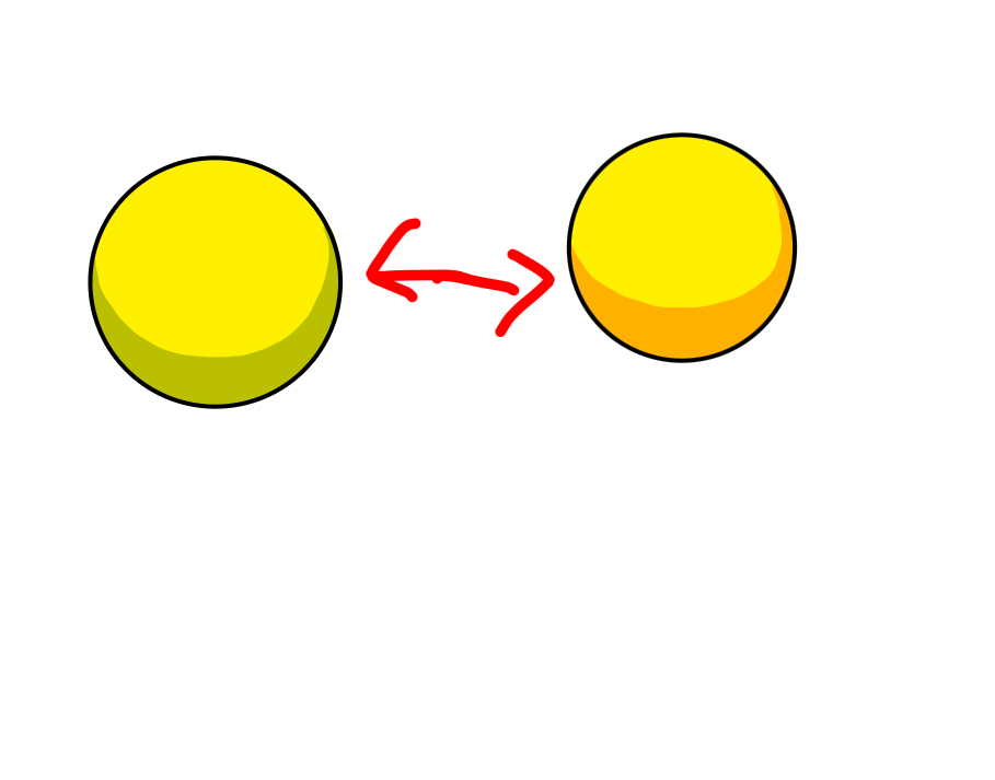
When it comes to shading in color. Most people tend to do it pretty well. But the most common thing i see in shading when people use color is. That they use the same color and just make it darker. There is nothing wrong with it. Besides the shading looking a bit bland. Here is a example of a good form of shading.
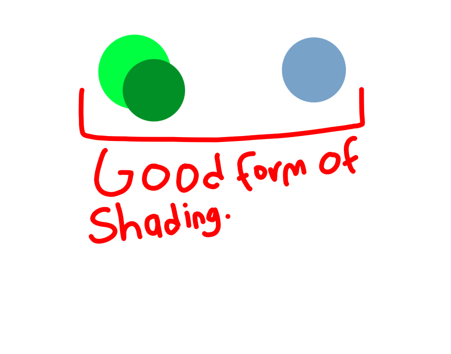
I used a a different color for green and white. Instead of just using grey as the shading. (Yes grey is also good for white but using a more vibrant color helps the shading make the color stand out more.)
For the next type of shading i see people use commonly is yellow.
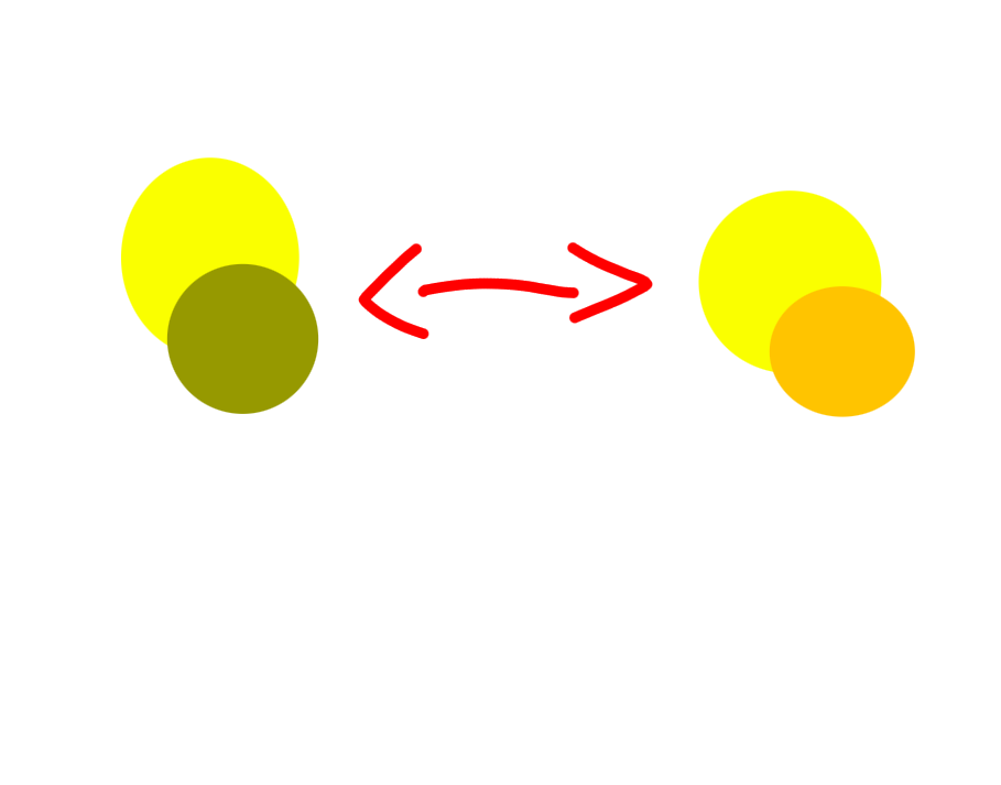
With yellow people tend to just darken the color yellow and shade it like that. But when that happens it makes it look like the said drawing with the darken yellow shading, makes it feel like night time than day time.
so i would prefer using orange or a darker yellow if you were shading and it was day time. Exmaple:
Like if it was night time and the moon was pointing at the object or person using a darkened yellow would be great for night. While if the sun was out and pointing at the object/ person using a darker yellow. While for a light orange/yellow would be great for the shading.
—I hope this guide helps people who struggle with shading. And helps them understand how it works and makes their art pop more! remember this guide isn’t to bring anyone down or hurt others. Or make others feel like their art sucks, it is to help them and understand how to use shading!