(post deleted by author)
1 Like
I’m judging thumbnails again
- do no get mad at me if what I say offends you(go punch a wall or something if you’re mad)
- don’t question how I judge these things I do my own thing
BellaIscool.com
-
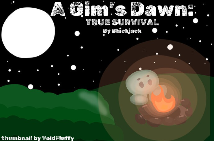
the outline of the gim + moon looks weird I recommend a better background remover instead of just an eraser
-
the moon feels out of place compared to the original image
-
the fire is kinda off the wood making it seem weird
-
it looks like you gave the wood a shadow if you are adding shadows make sure the gim and fire also have shadows
-
adding some lighting effects for the fire would make it look really nice
-
the eyebrows go well with the eyes(not common) nice job
-
sky looks nice maybe add a little variety to the size though
-
maybe add some bushes or trees? Just something to fill in some more space
Hamz717
-
VoidFluffy
- do you have a leaf or grass brush? some texture would be nice it looks a but too smooth
- also might want to slap a watermark on there
- I feel like a pine tree in the right would look good on the top of that little hill (feel free to completely ignore me)
- shading is cool maybe shadows?(sorry I have a thing about shading)
Sythic
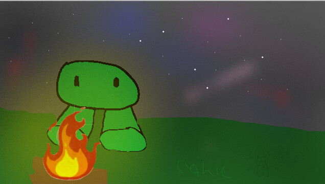
- your watermark can easily be removed
- it looks as if your drawing around parts use layers PLEASE or at least do the full background first
- the image is low quality
- the lines are scraty
- the grey sky looks off from the rest of the picture
- again better background remover(fire)
- maybe make it more clear that it’s wood?
- the angle looks wonky are you trying to make a sitting pose? if so shrink the legs down a little and move them close to the fire as the legs should not be above the horizon
do not ask me to judge you just don’t
5 Likes
I LOVE THESE AAAAAAA
1 Like
yeah, I got lazy : P
oh yeah 100%
Good idea, I might add that…
OML I completely forgot about shadows. Thanks for catching that.
1 Like
idk who’s too choose, I love them
1 Like
- VoidFluffy
- Sythe
- Bella
- Hamz
0
voters
fixed it
2 Likes
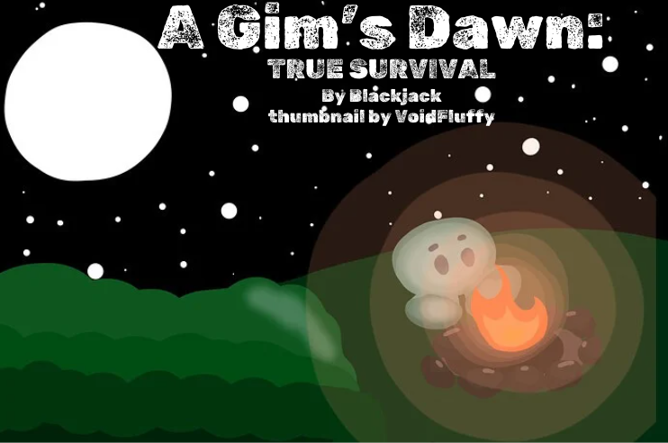
voidfluffy’s it is! Sythe yours is also SUPER GOOD! There’s room for improvement, but I love your thumbnail :]
1 Like
(love the style too, very epic)
Could you put the creds right below “by blackjack”? someone could crop it out if it’s in the corner.
Thanks!
1 Like
right away! (I feel your pain. Stolen artwork can hurt sometimes lol)
1 Like
i’m basking in the glory of voidfluffy’s thumbnail
1 Like
it’s fine just make sure not to do it again
gotcha
sorry bout that