AAAAAAAAAAAAAAAA
So, this thumbnail is pretty bad ![]()
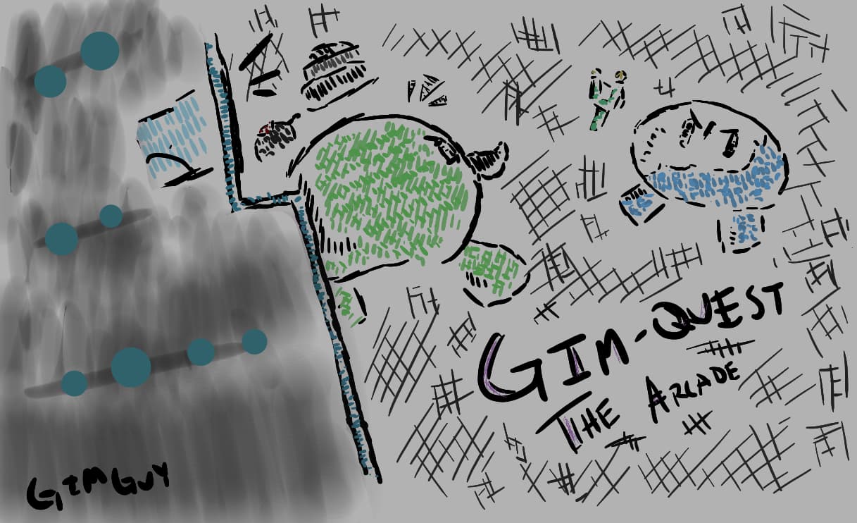
What should I do to improve it?
Maybe less strokes and more solid lines? (Not art expert)
there’s just too much to look at
the thumbnail should be simple and easy to tell what’s going on
Could I have some insight on what the story is about?
Just a arcade sort of thing where you participate in mini-games. So far I got what I needed, some insight from others on how to improve it. I’ll mark a solution and move on.
This topic was automatically closed 3 hours after the last reply. New replies are no longer allowed.