I’m really proud of it
What’s this post for exactly?
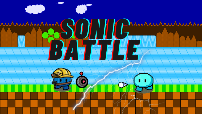
If you want me to rate it I say 8/10 which is pretty good! For the shadow of the gims, you used texture but shading should be kind of transparent. Definitely add more shading in the thumbnail…
Otherwise it’s nice!
This is off topic…
But my honest reaction would be:
Pros
Text effects are well done
Fence is alright
Good variety in background
Cons
Shading is weird on the Gims
There is no shading on the background
Appears like the Gims are fighting on a vertical wall which is… awkward
Weapon to Gim ratio is not proportionate
Clipart does not look good
Gims look out of place and don’t quite match the theme of the backdrop.
Overall Rating
5.2/10
I didn’t even notice the weapon to Gim ratio lol
9/10
The shadows and gim to weapon ratio looks off
lol
as an artist and art critic
i deep analyze
1 Like