Hey there! Nothing too extraordinary going on with this topic. I’ve just been working on a platformer of mine for about a week now and would like to get some input, feedback, and improvement ideas for a title card I’ve created as the lobby pre-game and in-game until it starts.
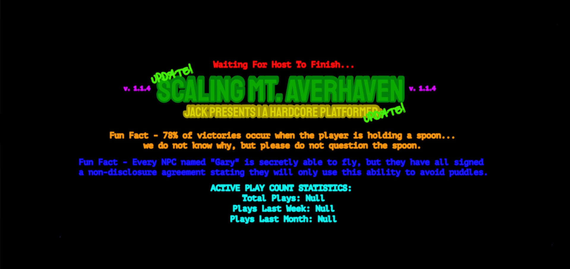
Here is an image of the current title card:
If this topic is ill-formatted or placed in the wrong category, please let me know. (This is addressed to those who have been here for a while and know how things work around here)
Thank you for taking your time to read this off-topic topic! (Lol) Have a great day!
-Jack
4 Likes
It looks nice, maybe you could add some extra stuff to the background though to spice it up a bit?
Maybe like stripes or a pattern or just anything to fill the emptyness.
3 Likes
Hmm, I could…you’re right. I was thinking the same, I guess I was wondering more about the specific patterns to include. If you could provide some, that would be helpful, in the mean time, I will experiment. Thank you for the feedback!
1 Like
I think some good patterns you could make are small but similar colored stripes, big stripes, slanted stripes, bars on the side or tops and bottoms.
There is also an idea for menu’s that I made a while back, its really nice and I think it would make it look alot better. (Il get an image rq)
2 Likes
The black background is kinda simplistic. If thats what you’re going for, then great! But maybe have some art of a mountain in the background, and maybe a sun peeking behind it with an animation.
The way you placed and used the text is very nice btw.
2 Likes