Hello fellows Jimkiters!
I make a “. . . . .” works with any amount of dots
Set its outline to max
and um…
Even crazier is that different fonts make different patterns
Why is this happening?
10 Likes
Ok, that is pretty cool.
Zappy_Zaptos:
Hello fellows Jimkiters!
We are GIMkitters not Jimkitters.. Lol
9 Likes
Is this a bug or what tho
WE WILL NOT SURRENDER:
Let me test it out.
the size is at 22 if it helps, forgot to say that
5 Likes
Don’t know. Let me test it out. I always keep a gimkit page open.
1 Like
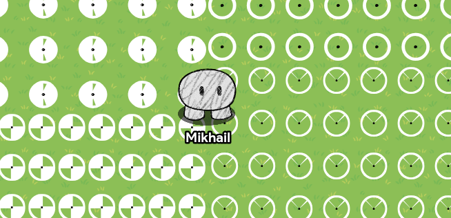
AlexC
November 21, 2025, 3:07pm
7
This might be one of those very special symbols you get by typing certain letters or keyboard stuff like > # W % X ( & ` in a certain order.
Edit: I just realized it’s the “Stroke Width” border and different fonts that are causing this. :\
2 Likes
This is not a bug. I tested it. Every dot has different styles.
3 Likes
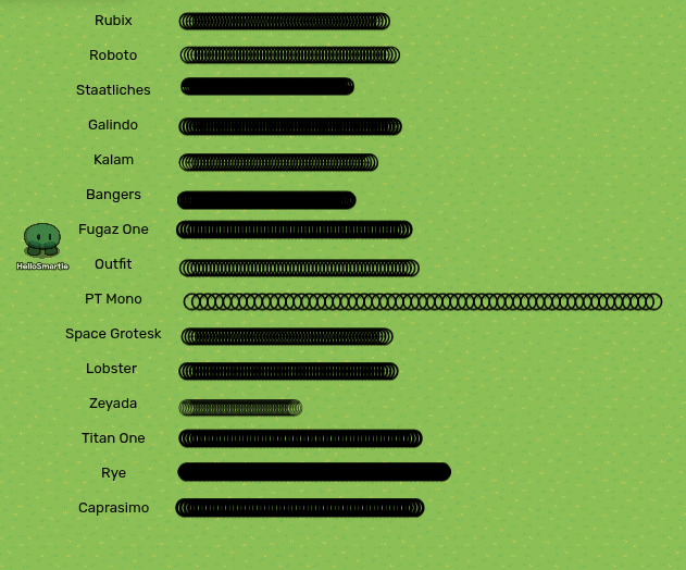
I found some more characters with the same effect
’
4 Likes
Nate1
November 22, 2025, 10:05pm
11
Yeah, just checked on 5 different computers. Not-a-bug. (TL3 add the tag or is it too much to ask?)
Zappy_Zaptos:
Jimkiters!
Get it right gangletonGIMKITTERS
6 Likes
Oh wow, very cool!
I believe most, if not all special characters will undergo the same outlining effect.
10 Likes
The not-a-bug Bugs
Also I’m pretty sure this is a bug. As most fonts leave their period image the same as an Ariel font, the outline should not change depending on the font. Although, @Gimkitsuggestor is definitely right about this being a neat in game art technique!
7 Likes
Gimkitsuggestor:
I wanna revive
alright, tell us something related and intresting
i can remove it
4 Likes
ahh ok thx for clearing that up
6 Likes
LEts think… Um maybe cool patterned floors? and maybe some of the designs for cartoony eyes?
with this we could maybe tinker with other sorts of this type of outlining Behavior to see if we can find new patterns and sorts?
5 Likes
Custom patterns for the shield prop? The ones cut into quarters could be used for a crash-test dummy.
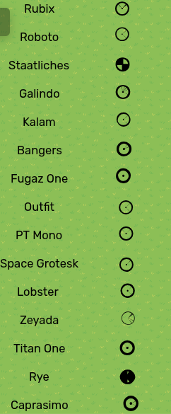
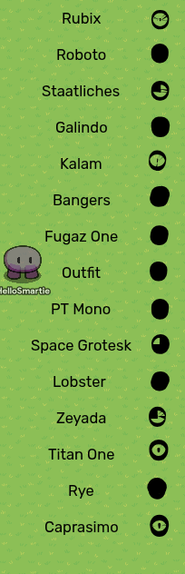
Can someone supply me with the number of fonts possible, and the max number of how much str0ke width can be used? I wanna try something.
Okay, if there’re 15 fonts, and 37 sizes of str0ke width (including 0) then there should be…
555 different ways to make these symbols.
7 Likes
Question, does text size have an effect
Edit: Yes it does, and quite an intresting thing happened with the text size.
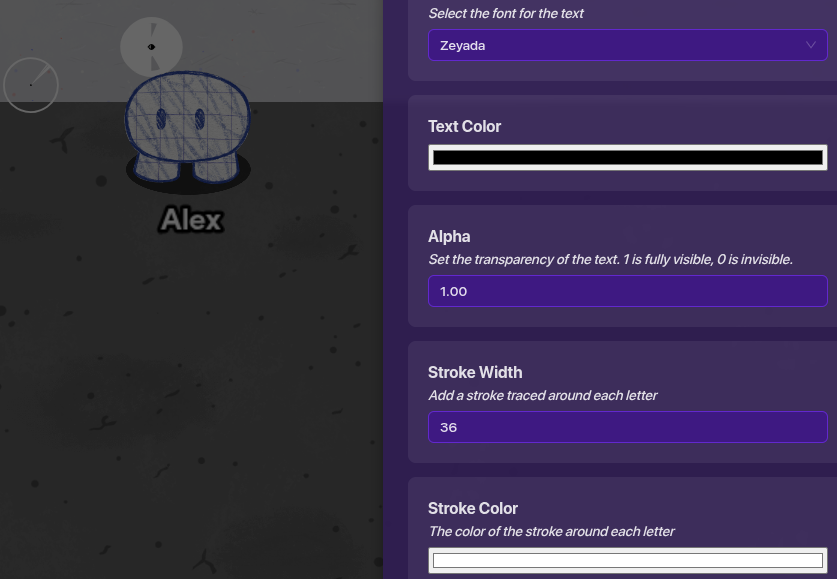
HelloSmartie:
Also only 1 color
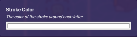
outline color can be changed yk
barbed wire
5 Likes
By the way I looked at this one could be a header
I made this with the Rye font and bangers works to
Could be a nice header.
But it only can be 30 max font before it breaks apart
Also only 1 color
5 Likes
I did this for fun
To make it look more clean and organic, cause its a header, one color is the best. That’s why I said that. I knew outline color could be changed.
7 Likes
Hey guys,
Kormorant:
what kinds of ideas?
Basically whatever you can make with these text items, like for example barbed wire if you combine alot of dots together.
Added the
’
Thought Caprismo looks like an eye
5 Likes