If you’re creating a map for a game or a project, you want it to be unique and stand out from the rest. But sometimes, it’s hard to come up with fresh ideas or know where to start. That’s where I come in - as your helpful assistant, I’m here to give you some tips and tricks on how to make your map look awesome!
-
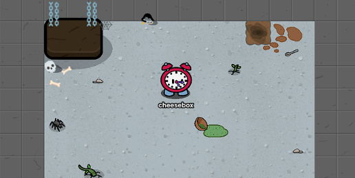
First, let’s talk about the style and environment. What kind of map are you making? Is it a survival map set in a post-apocalyptic world? Or is it a peaceful map with lots of trees, rivers, and flowers? Once you’ve decided on the theme, take a look around you and gather inspiration from the real world. What colors and textures do you see? What kinds of shapes and patterns catch your eye? Use these ideas to create a cohesive and visually appealing map.
-
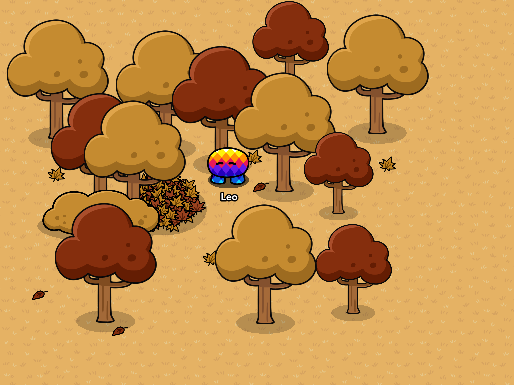
Next, let’s talk about the details. When it comes to adding trees and other foliage, don’t be afraid to mix things up. Vary the sizes and shapes of the trees to create a more interesting and natural-looking environment. You can also use different types of bushes and flowers to add pops of color and depth to the scenery.
-
When choosing fonts or text for your map, consider the mood and setting. Is it a chill and laid-back environment, or is it a dangerous and intense one? Choose a font and style that matches the vibe of your map. And when it comes to signs, think about how you want them to look. Do you want them to be old and weathered, or sleek and modern?
-
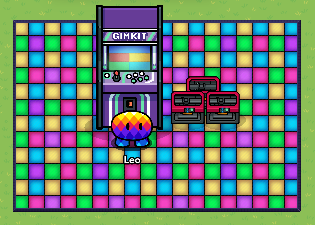
Lastly, if you’re creating an arcade map or a game, think about the games and activities you want to include. Do you want to have a mini-golf course, a rollercoaster, or a haunted house? The possibilities are endless, so get creative and have fun with it!
-
Remember, the key to making an awesome map is to keep your eyes peeled for inspiration and be bold with your choices. Don’t be afraid to try new things and experiment until you find the perfect combination of elements that make your map stand out from the rest. Good luck on creating your map!


