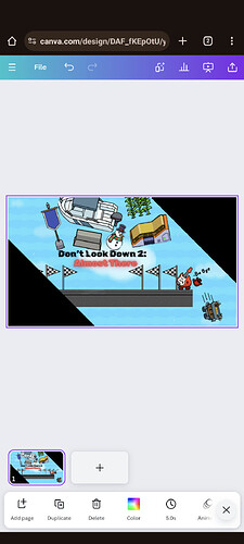
Hey guys on a scale of one to ten could you rate my thumbnail for the platformer map I’m making when it comes to season ticket holders.
2 Likes
A good 7/10! My advice:
- The stuff at the top looks a little jumbled, maybe space it out?
- I love the gims! The hand looks a little weird, maybe erase that line below the fingers?
- The triangles look nice, but maybe add an outline, or make them smaller?
Overall, one of the best Canva thumbnails i’ve seen!
(I do hand drawn, so…)
2 Likes
9/10!
I would not do the “Buh - Bye” & instead do bye-bye. It’s really good and I can’t wait to see what you do next!
pretty good
also next time Art is only for guides
1 Like
Thank you so much, this is really good for a first reply, as I’m new to the forums.
Thank you so much for the support
1 Like
Ohhhh, that makes more sense, thanks for the info
2 Likes
No problem! Just helping a fellow gimkit-er out!
I suggest making the gims and text bigger and more centered as once you use it. It’s going to appear a lot smaller
Okay will do thanks!
1 Like
