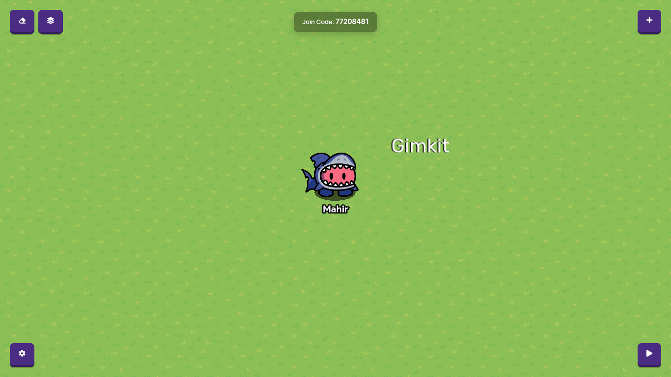
This is the tutorial on how to make really cool text, Start by clicking the “+” sign on the top right of your screen. After you click it, you should see four options, Props, Terrain, Devices, and Wires. For this post we will be using the “Devices” option. Click it then type “Text” in the search bar. When you’re done, place it down and type whatever you want to say, for this one I’m going to be using the word, “Gimkit”.
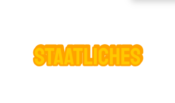
After you’re done with that, make the color of the text white. You will see why later. When you’re done copy the text by hovering over it then pressing “C” and placing it down. Place it down right near the original text. Finally, Choose your font by clicking on them both, (The font is optional.) When you’re done, click the text behind the text in the front, and color it black. After you’re done, it should look something like this,
And there you go, its all done and beautiful, let me know in the comments if you chose a particular font, and good luck creating!
(PS you can also make the black text a little farther away to give it a better look!) Also sorry for not giving enough pictures it doesn’t let me for some reason.
likes
nice guide, but I’m pretty sure almost everyone here knows how to do that.
But anyways, Welcome to the forums! Always stay on topic and be respectful!
My favorite font in gkc personally is lobster.
Even though this guide is pretty simple I still like simple guides for people that are new to gimkit creative.