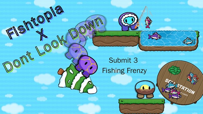
Hello everybody, I am pretty good at photoshopped thumbnails using websites such as Canva, Google Slides, Google Draw, and much more! Even if you are bad at making thumbnails don’t worry we are here to improve your skills.
Here is an 7-part guide to making good thumbnails!
Chapters
- Introduction
- Neat and Elegant Text
- Canva Tools ( For Canva )
- Shading and Details
- How to add Gimkit stuff
- Effects
- Conclusion
Introduction
Making thumbnails should be easy and user-friendly, a website many people use is Canva. Canva has multiple tools and easy flexibility. Even if you don’t want to use the premium version, you can make awesome thumbnails using the base version.
First what you want to do is get a good background for the thumbnail, you can either go on Google and copy a realistic background for your thumbnail, or you can use a gradient which is simple and has no complexity. I use both, but when it comes to what thumbnail I am making I decide. After having a nice thumbnail or a gradient I would recommend asking a friend if they like it, to see if the thumbnail would satisfy the person. After you have a good-looking background we need to have some text!
Neat and Elegant Text
Text is the second most important part of a thumbnail, without it the thumbnail is incomplete and looks horrible. If you want your text to look neat and nice I recommend scrolling through Canva’s option until you find something that’s nice and readable. After finding your text you need the for size, the font size should fit for your text and it is ok if it covers some of the characters up. Just like this thumbnail
The Don’t Look Down part covers the purple gim, but it does not affect the thumbnail.
Next, we have effects, effects are really cool and make the text stand out from other products in the thumbnail, all you have to do is select your text and there will be an effects button, you click that button and select an effect that suits your thumbnail. Wow, you have really good-looking text, but let’s move on to Canva Tools.
Canva Tools
If you don’t need canvas tools you can move on but this is a really important part of the addition to making really good thumbnails. I use this add-on called Image Upscaler because when I copy an image from Google and I make it bigger the resolution of the image will significantly change, If I use this add-on it will make the image better resolution and non-pixelated. Another add-on I use is Dall-e, this is a AI that helps make images for me, It sometimes creates horrible images but if you add more detail to the image you are sure to get a AI-generated image that looks nice. Last but not least I use remove.bg, there is a website where is you put in the image it will remove the background for any item you want, I also know that there is a remove bg feature for canva but it is for premium only, I also have premium. Well now your thumbnails have awsome clarity, background, and AI images.
-----------------------------------------------------------------------------------------------------------------------------------------Shading and Details
Details are the most important part of a thumbnail and so is shading, If you go to the edit image section in Canva you can see a shading button to add some foreground to your images, Well you can mess around with the option, but DO NOT add too much shading as it ruins the image and feels like you just messed around with the controls, for details I get an image off-of google and I make the size correct ( almost about gimkit size ) and I put it on to one of the gims.
p.s. Do not shade the details as it are supposed to be on in something, if you shade them it makes a eel that the gims are not holding them.
How To Add Gimkit Stuff
Inorder to make your thumbnails good you need to import gimkit gims, all you need to do is get a image from google, copy the image, use remove.bg, and import it into canva which is really cool, thanks the the wiki almost every gimkit item is available online
Effects
In Canva there are multiple options you can do, such as shading, image upscaling, AI, and effects. You can add some effects to make your thumbnail suitable for the game you are creating, If you don’t these thumbnails will look horrible and won’t make much sense. Some effects are pixels and shadows. If you can add them to your thumbnail it will look awsome.
Conclusion
Well if you have horrible thumbnails and need some don’t hesitate to reach out to me, and if this helped you please like this and share it to others. Follow these tips to make your thumbnails better
