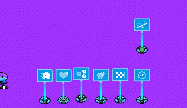
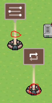
A lot of people don’t pay attention to the appearance of devices. However, during my attempt to make a Periodic Chart of Devices, I noticed that the group of devices with a hologram-like appearance(like waypoints) have different colors that often correlate with their main purpose. For instance, most orange devices display information. However, there are a few outliers. Here is a list of devices and their colors, and a couple of things we can discuss. For simplicity, I will refer to the hologram-like devices as “HoloDevices.”
Brown - (Devices that can manage certain mechanics) Tag Zone(HoloDevice), Repeater, Movement Meter, Inventory Item Manager, Laser Beam Manager, Knockout Manager, Player Coordinates.
Orange - (Things that display information/Text)- Waypoint, Game Overlay, Popup, Notification, Property, Starting Inventory, End of game Widget
Pink - (Things that interact with something on behalf of certain player(s) Lifecycle, Relay
Blue - (Things that interact with Gimkit Mechanics) Checker, Health Granter, End Game, Respawn, Speed Modifier, Team Switcher, Damage Boost
Misc. - (Any other mechanics that the player can interact with/don’t fit into the above categories- Tag Zone, Sentry, Flag, Zone, Flag Capture Zone, Questioner, Laser Beam, Camera View, Vending Machine, Text, Button, Teleporter, Trigger, Item Granter, Counter, Barrier, Item Spawner, Checkpoint, Crafting Table
Other:
1: If a whole color group is in bold I’m confused about what to categorize that color group as. If only a few devices out of a group are in bold I don’t know why they fit into that category.
2: How could I use this in creating my periodic table?
3: Do you think the colors the devices are sorted in are intentional by the devs?
4: Could this potentially help in organizing/categorizing devices?
Sorry for taking nearly half a year to make a post in every category the large amount of questions and information. I hope this is useful in a way.

