Okay, before we start this guide, @cheezesRcool commented on my guide to put in a section about color theory. But since then, I kinda wanted to know more about it and its relationship to art in GKC maps sooooooooo…
Hello! Welcome to Color Theory in Gimkit 101, a guide made by M_oop. If you saw my last guide, there was a section on color theory. but I wanted to put it in a separate guide to talk about it more!
Color Theory Basics
Color theory is the study of how colors interact with each other and impact our mood. It gets much more advanced, but this section is just about the general ideas and concepts of color theory.
Color Wheel
Reference:
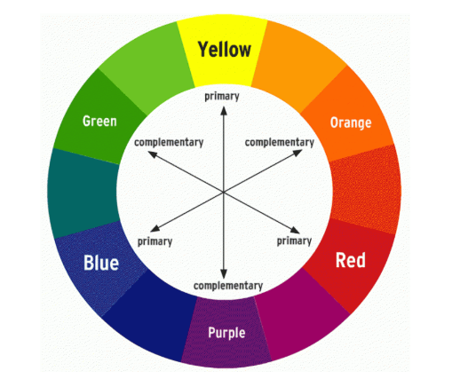
The color wheel is what shows the relationships between colors. Which brings us toooooo…
Color Mixing!
Primary colors: The colors that mix together to create basic secondary colors (red, blue, and yellow)
Secondary colors: The colors created by mixing primary colors (
Tertiary colors: The (probably) least known type of colors. Created by mixing primary and secondary colors.
Color Relationships
Complementary: Colors that are opposite to each other on the color wheel. (ex: red and green)
Analogous: Colors adjacent to each other on the color wheel
Triadic: 3 colors equally spaced out on the color wheel (oddly specific) (red, yellow, blue)
There are MANY more, but there’s no way I’m listing them all here so there are the basics for you.
Source: “The ultimate guide to understanding color theory in design” (NOT A GIMKIT GUIDE, found online)
Emotional impact
Different colors are often associated with different emotions. Warm colors (red, orange, yellow) are associated with high energy, and sometimes anger. Cool colors (green, blue, purple) are associated with calm, relaxing emotions.
So what does color theory have to do with gimkit?
Well, good question. Color theory can make Gimkit games feel more put together (like using strategic colors schemes to bring emotions and consistency to areas of the game), add lore to the game (like creating a mood for each level with a different color, and players have to figure out what they all mean), and to just make your game look good!
Using complementary colors
This is pretty self explanatory. It makes obstacles stand out against the background. It ties different colors into different areas of the map. Examples:
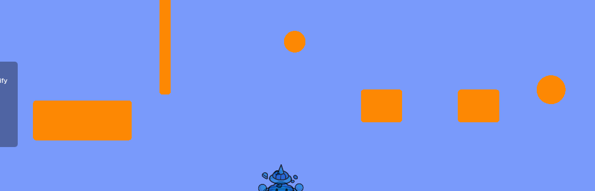
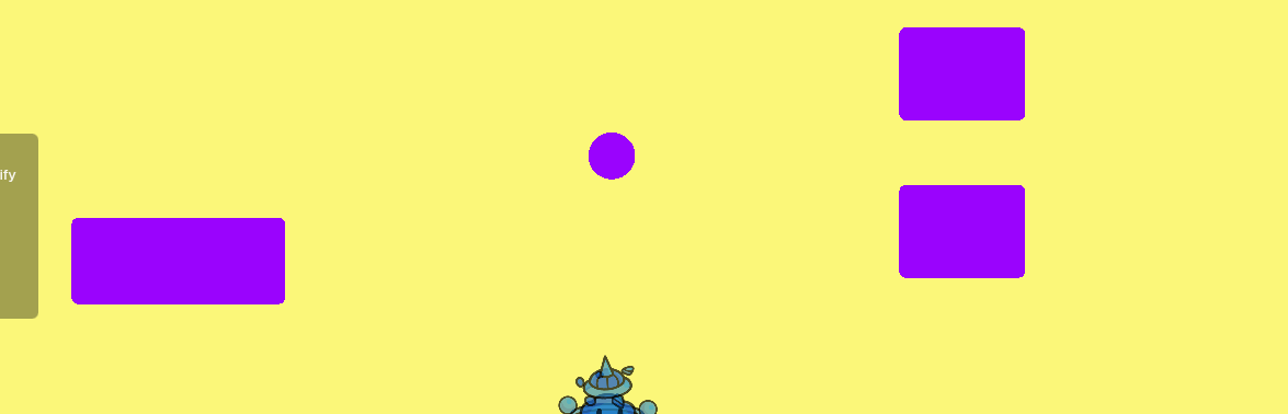
The complementary colors of the parkour obstacles stand out against the background.
Meanings and emotions
Reference image:

Look at the “Meanings” section. Different color backgrounds can display hidden meanings and make the players engaged in the game-play. It subtly gives the player feelings about each level. A green background can be associated with safety (like there are no sentries in this section). @cheezesRcool (once again : p) Good idea so I’m just gonna quote your comment
Shading!
If you haven’t noticed, only top-down style maps naturally have shadows under objects. Platformers don’t. If you are placing props on top of terrain, if you want a more high quality, unique finish, you can use barriers to add shadows under! It’s so simple! Tips n’ tricks: Make the barrier color gray, and also, make sure it’s not at full transparency!
Vibrant VS Desaturated
Reference:
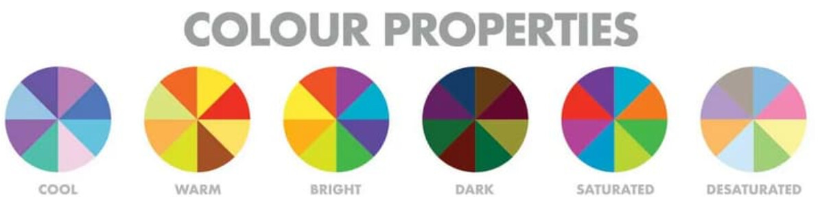
Vibrant colors can make a section of your map look eye catching and exciting, and Desaturated colors give a more soft, toned down feel.
Color Palettes
For your map, (or a part/section of your map) be creative and play around with different color palettes. Make sure to be consistent! Stick to limited color palettes, so everything looks put together.
Conclusion
There are many uses for color theory in GKC maps! (I know this guide doesn’t include very advanced color theory, but it has the basics needed to understand the connection!)
That’s all for now!
Here’s some emojis for funzies: ![]()
![]()
![]()
(edit: dang this is my 2nd guide and it already has 13 likes… i did NOT deserve that…)
Credits:
@cheezesRcool for the idea! inspired me to make this guide!
guide made by @M_oop (me)