Can anybody help me improve my thumbnail for my shooter game

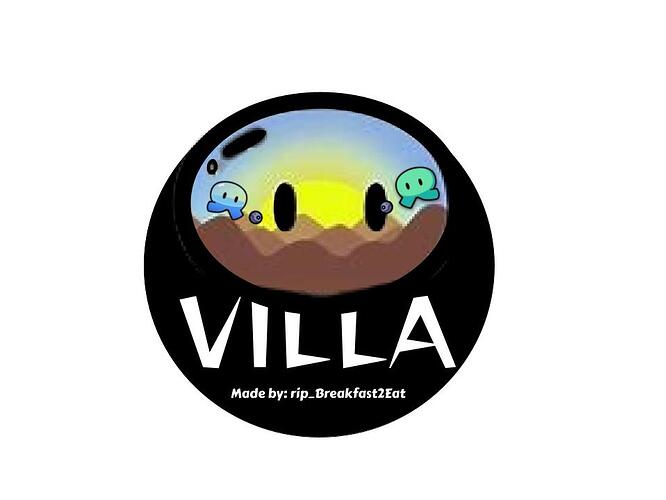
So this is what I have right now-


But. It needs to be polished.

  1. I still want the sunset gim in the background.
  2. I only want two gims in the image (not counting the one as the background).
  3. make sure to reference yourself as the artist and me as the creator.
2 Likes

can I give it a trie

I think it looks good as it is good job on it

looks good but i would find a horizons gim in higher quality

2 Likes

I’ll give it a try too!

Remember art is only for Community Made Guides

I can make one! But I might make it later

I think the thumbnail you already have is really good.