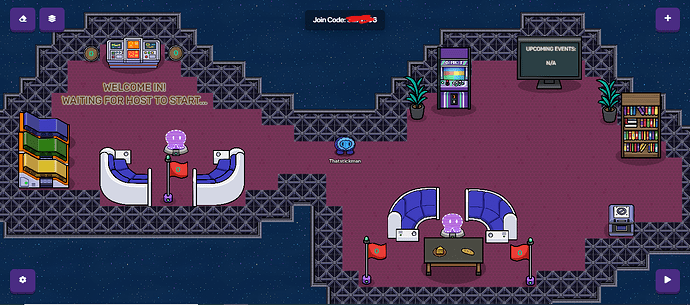
yeah, what can I add
- It’s not a bunker
- If you read you would have known that Potato Jay has already suggested a font and Stickman is trying to recreate it
- You need space to walk around
- It’s a lobby, not an entire arena
i did double layer the walls though. You think I should remove it?
- I don’t even know what that means, layering your walls is a DESIGN TIP and not something that applies to a specific map (in this case, a “Bunker”).
- My fault
- What, are 2 plant canisters and a space crate going to prevent you from going everywhere?
- It’s NOT going to be an arena if you make the lobby close to the size of the screenshot.
Almost all your “counters” took my suggestions to the extreme. No, a few more props (that could be near the walls, by the way) are not going to block anyone, and expanding the lobby a little ISN’T going to make it the size of an arena.
sigh
1.I lose on this one
2.We good on this one ![]()
3.I lose too ![]()
4. He’s zoomed out, you know how cars have those mirrors that say “Objects are closer than they appear”, yeah, this more like “Lobby is smaller than it appears”
@Thatstickman Oh yeah, have you made sure none of your “walls” are actually floors? This is a personal mess-up for me but it’s good to check! ![]()
also that code doesn’t work i realized my mistake as soon as i sent it
yep! all good! also i do that all the time too haha lol
Make the walls a layer higher than the floor
Out of curiosity: Can you send Screenshots of your entire game or did you just started the lobby?
okay, will do. Thanks!
literally thats all I have ![]()
oml,
- layering your terrain is good NO MATTER WHAT, mainly because it makes the floor and walls not combine and makes it look better,
I guess you want to get wywy’d by sir wywy. - alright I get that
- props can be sized to be smaller
- they never said that it had to be that big, maybe just a little more space.
PLEASE, don’t do this when it seems you don’t know what your talking about.
I agree. This is yet, the most amazing lobby ever. I’l make sure to try to play the game! (if I find it) Say, do you need a thumbnail for that game? I can make one if you give me a few details!
._. but layering pls
I don’t have anything for the game yet, just the lobby. And yeah, sure! If you want to do it, I will gladly take a thumbnail!
You want honesty? I’ve come to the right place.
For the most part, this is pretty good.
The shape is… ehh… oblong?
I do advise centering the text and making it more unique. Make the room symmetrical. Play around with no collision props and layering.
Other than that, it looks pretty shmazzy!
set the floor to a lower layer than the wall so the walls outline goes up a bit. its a small change but it makes the whole thing look better
will do. Anything else?
