I would Recommend Shading
I don’t rlly have a good website to do it on anyways, so this is the best I can do. But thank you for all the tips! I think you rlly helped me out!
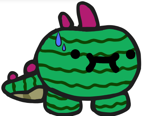
I mean I’ve seen worse, but this thumbnail needs a lot of work. I suggest practicing a lot (on things like gim shape, straightISH lines because I can never get one PERFECT, and evening out the eyes)
shading and use more colors
What website do you use (might I recommend kleki)
I see what you mean @Rainbow , but again, the website I use doesn’t have a lot of good features.
what website do you use?
That looks much better than the previous one
I use the website canva (srry it had to be twenty characters ;/)
lol i use canva too
I suggest using, Pixlr, Canva, or Adobe Illustrator (What I Use)
if you want i can give tips on how to take advantage of canvas features
You can do this = <12345678901234567890>
Oh I would use something like kleki. Canva has limited “materials/features” in my opinion. Kleki has much more diversity.
I use Pixel Art (Drawing) And Pixlr or Canva and Kleki.
Mostly Pixel Art (Drawing)
ahem (getting a bit off topic)
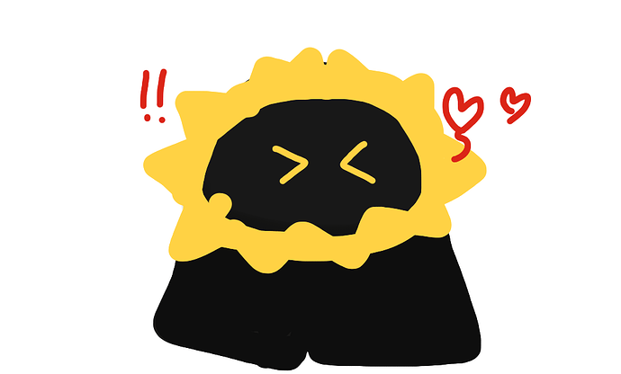
any ways i suggest you add a bit of shading to the characters like this
Summary

also use actual gims to out line yours in the thumbnail like this so they look more authentic i suppose
Summary

I like the new upgrade!
Heres my tips:
Summary

The r0bber “appears” to be running, you might try to get a gimkit skin running from the picture above
(no offense I almost thought they weren’t gims…)
Summary 2 (Optional)
In order to give the gims the facial expression you want to pull off, try giving them a facial expression on their faces! Example:
#worstexample
DON’TS
Don’t use exactly black or white, try using a black close to actual black or white
(I left my typing out for too long oops)
yea like good advice maybe have it look like this maybe
Summary


